
@tgkvoidsales
BTS Photocard Press Guide
This project is all about helping us collectors figure out the different production presses and potential misprints on BTS photocards. By showcasing the differences between presses and common misprints, the project seeks to provide collectors with the information needed to understand how photocards change overtime and that just because a pc looks different doesn't always mean it's fake!This project is ongoing and will be modified and updated as new information comes to light!!
"૮₍ ˶•⤙•˶ ₎ა
If you'd like to add the link to this project to your collect account via linktree, carrd, highlight, etc that is OK as long as I'm credited! If you would like to use my guide as an outline for your own project that is OK as long as I'm credited. The goal is simply to make this as accessible as possible!
If you are interested in translating this guide in your language please reach out to me via instagram or twitter!
If you'd like to help out with the project with any additional information please dm me.
Photocard Presses
What are photocard presses?
A photocard press refers to the standard way a photocard is manufactured. Photocards from the same 'press' typically have the same qualities such as shape, size, corners, quality, color, etc.
Why do photocards have different presses?
There are multiple reasons why photocards may have multiple presses. Companies may rerelease old/limited photocards years later when their method of production has changed resulting in an old photocard being reproduced differently than the initial release. Additionally companies may change the way photocards are manufactured to optimize costs and production rates by altering their look/texture in a way that is easier to mass produce. An example many BTS collectors may be familiar with is when HYBE started using YG Plus to produce albums/photocards, resulting in a major change in the look and quality of certain photocards.
Frequent Terminology
1st/2nd/3rd/etc press: Used when I am confident in the order of which the presses were released. (1st being the oldest, the biggest number being the newest)
Press type 1, 2, 3, etc: Used when I am not confident in the order of which the presses were released.
Old press/new press: Used when there are just two press types and I am confident about which came first.
Photocard Misprints
What is a photocard misprint?
A misprint can be defined as any manufactured photocard that was not produced as intended, resulting in visual errors that differ from properly printed pcs. This can include shape, size, photo quality, color, fonts, texture, etc.
How is a misprint different from a different press?
Misprints are unintended mistakes that are typically limited to a specific batch, production company, or even on an individual basis, whereas different presses are a planned change in production due to the companies choices.
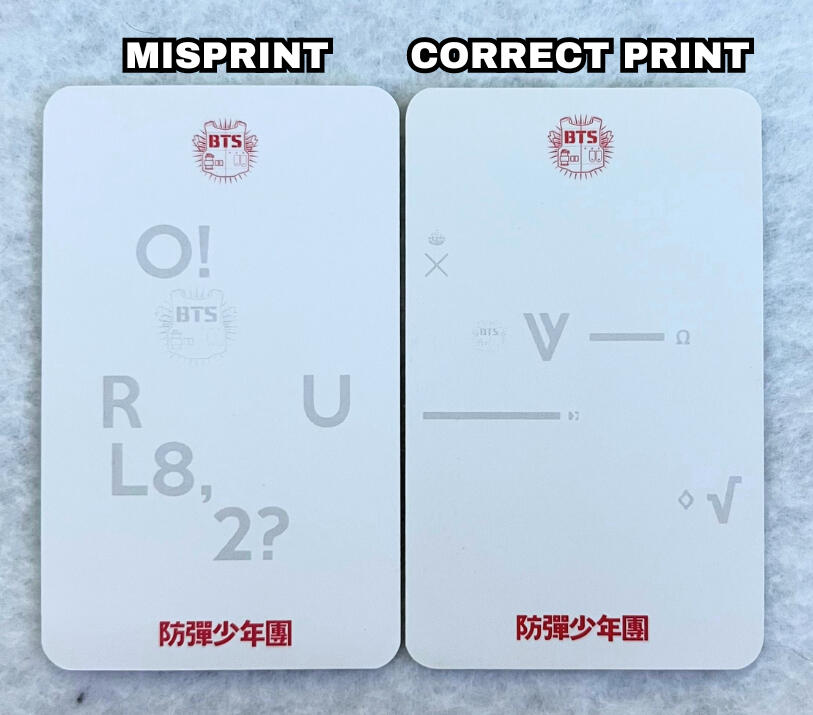
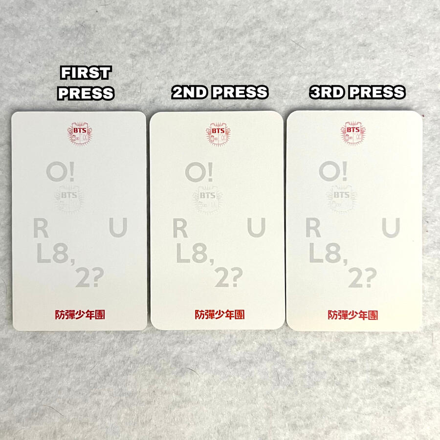
O!RUL8,2? Member Photocard Misprint
A fairly common misprint on the O!RUL8,2? member photocards is where "O!RUL8,2?" is printed on the back instead of the members name. Typically only the group photocard has "O!RUL8,2?" on the back, however this misprint can occur to any members pc.
SPECIAL THANKS
@yoonjintradess for providing the misprinted photocard.
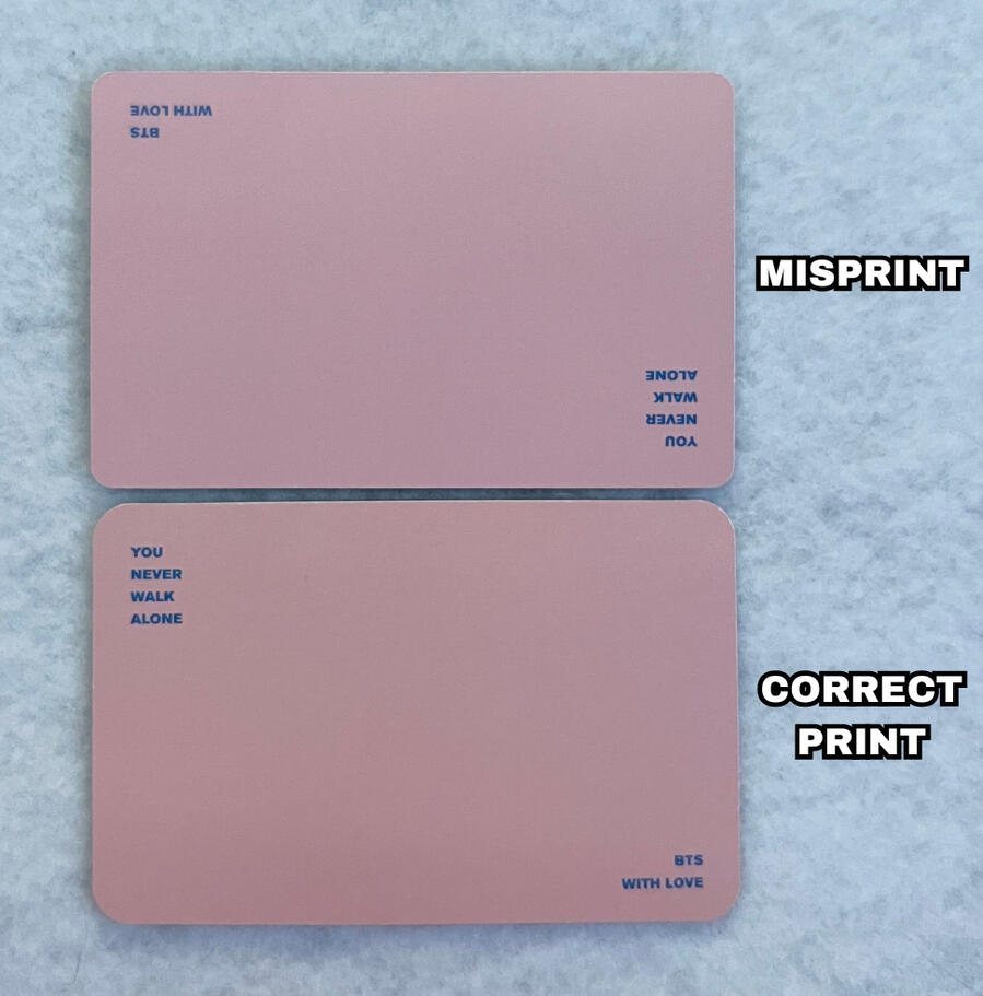
You Never Walk Alone Group Photocard Misprint
A fairly common misprint on the You Never Walk Alone (YNWA) photocards is where the text on the back of the group photocard is printed upside down.
The video below shows a more clear view of this misprint.
Aside from the misprint, if you noticed the photocards look slightly different, the two photocard examples shown are also two different presses, please click here for more information on YNWA photocards presses.
SPECIAL THANKS
@vhopekookie for providing the misprinted photocard.
Memories 2018 DVD Photocard Misprint
The memories 2018 DVD Photocards have an interesting and fairly uncommon misprint where the "2018" text on the back is green instead of purple.
NOTE: if you are viewing on mobile pinch to zoom & If you are viewing on a computer increase your window zoom to 300%-400% on the picture below to clearly see the difference.
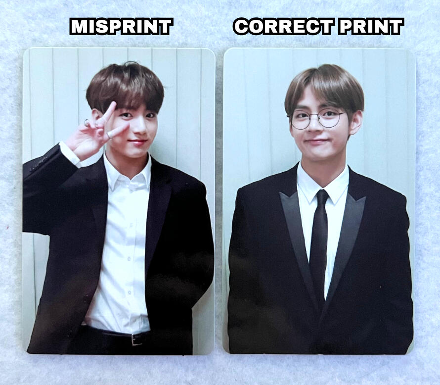
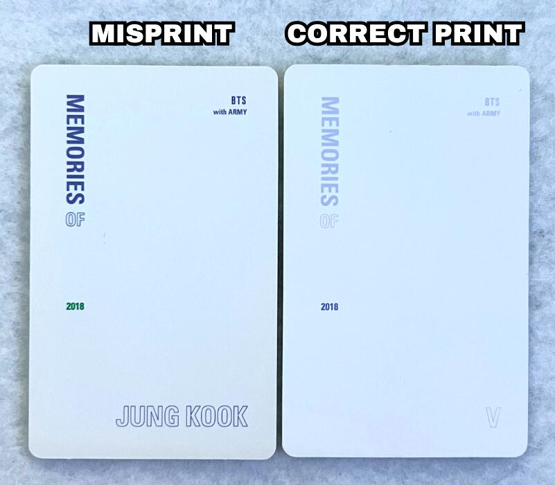
Aside from the green "2018", the misprinted PC also has a much darker/bold shade of purple for ALL other text on the back, whereas the correctly printed PC has much lighter/faded purple text.
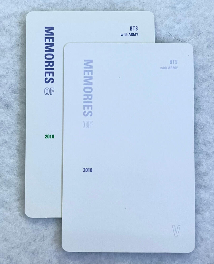
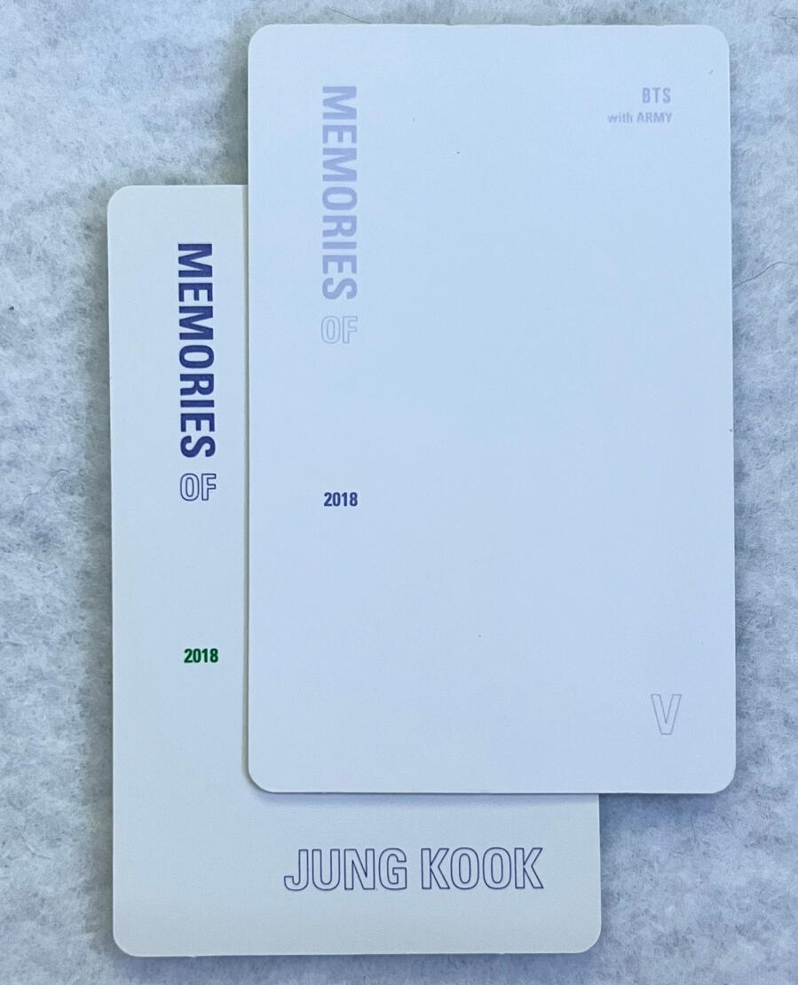
Additional observations: the white background on the back of the misprinted photocard (Jungkook) is slightly more warm toned/off-white. However this may be due to age as photocards tend to yellow with age. These misprints originally circulated around 2019 as far as we know, making them decently old.
SPECIAL THANKS
@koowoozoos for providing the misprinted photocard.
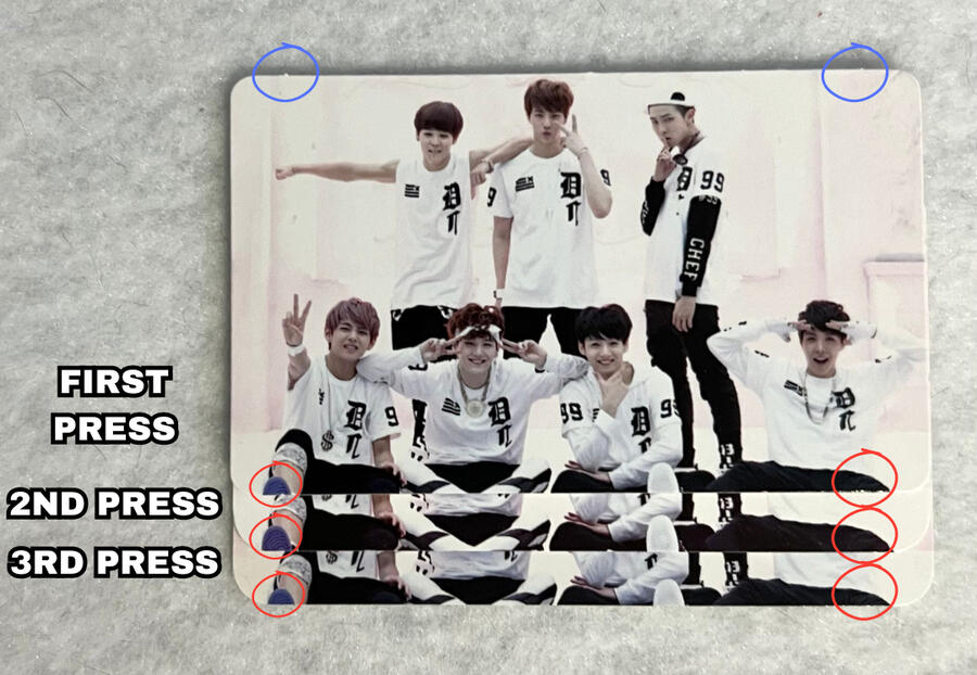
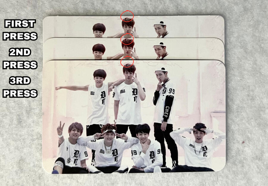
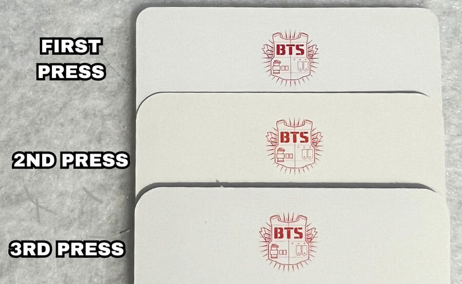
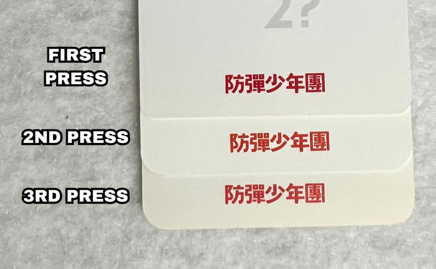
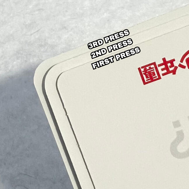
O!RUL8,2? Photocard Presses
O!RUL8,2? photocards are tricky. They are wildly inconsistent with coloring, cropping and corner inconsistencies spanning throughout all of the press types. It can be difficult to determine between real and fake cards as well as which press they are. From my research the most reliable way to tell apart the presses are stem cuts, the texture of the back, and the thickness of the pc. From that, as of now I've picked out 3 main press types.
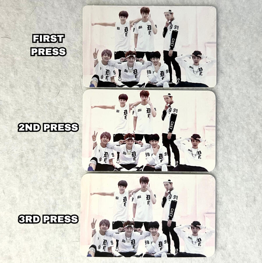
STEM CUTS:
Stem cuts are the little tabs you see on most photocards which can be on the edges or corners of photocards.
Only the 1st press O!RUL8,2? photocards have stem cuts. The newer presses do not.
NOTE: See the blue circles on the image showing the stem cuts.CROPPING:
O!RUL8,2? pc's can be inconsistent regarding cropping, so please do not use these examples as the ONLY way these can be cropped, this is just an observation with the GROUP cards. Member cards may be cropped differently, but I still wanted to include it.
NOTE: refer to the red circles on the images showing the different croppings on the top and bottom of the cards.
COLORING:
1st press O!RUL8,2? photocards have typically darker red color on the BTS logo and text at the bottom, whereas the two newer presses have a more vibrant/red red. However once again, there have been instances of the shade of red still varying within one press, keep that in mind.
NOTE: if you are viewing on mobile pinch to zoom & If you are viewing on a computer increase your window zoom to 300%-400% on the picture below to clearly see the difference.
NOTE: Please disregard the yellowing on the 3rd press card, that is due to age/poor storage.
CORNERS:
1st press photocards have the 'sharpest' or 'tightest' corners, whereas typically 2nd press has the roundest.
The difference with 3rd press photocards is the inconsistencies. The corners on this press can vary as they typically have rigid/uneven cuts on one or more of the corners. It can sometimes look like the corner was cut unproffesionally, similar to the Proof album lucky draws or butter 777 photocards.
TEXTURE:
ALL three press types should have a glossy front and matte back. As seen in the video below however, 2nd press photocards are slightly less matte. They reflect light a bit more than the other two, but are NOT glossy.
THICKNESS:
2nd press photocards seem to be the thinnest and most flimsy out of the three.
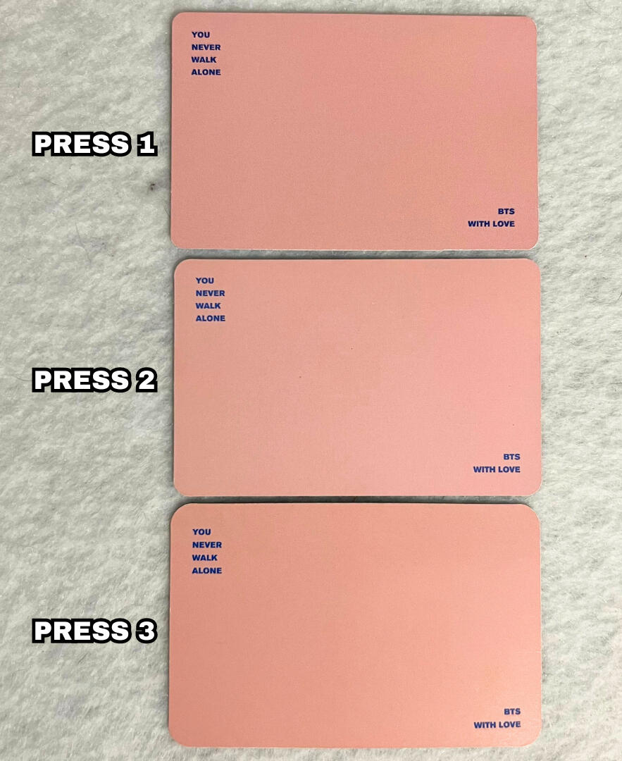
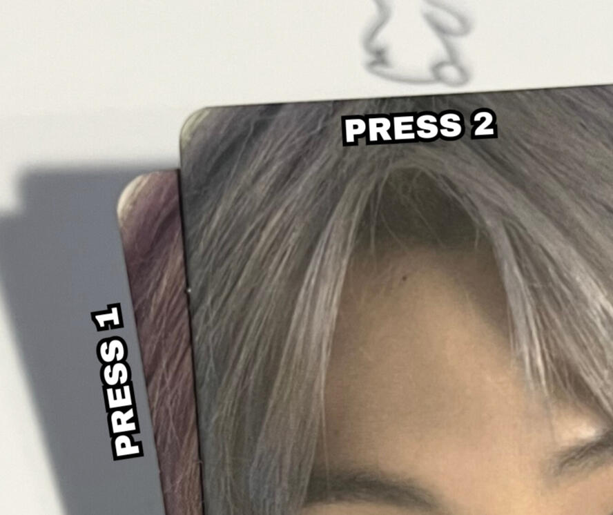
You Never Walk Alone Photocard Presses
As of right now there are 3 known presses for the You Never Walk Alone (YNWA) Photocards. The main differences being the stem cuts and corner shapes.
COLOR:
It is important to note that color variations aren't always a viable method of determining press types as they can have inconsistencies within one press, however I would still like to point out the differences.
In the images below, you can see that press 1 is more vibrant/saturated compared to press 2 and 3. It makes the other press types look overall lighter/brighter.
Additionally, the shade of pink on the back of the photocards changes pretty dramatically between each version, press 3 having the "peachiest" tone and press 1 being the darkest typically.
NOTE: if you are viewing on mobile pinch to zoom & If you are viewing on a computer increase your window zoom to 300%-400% on the picture below to clearly see the difference.
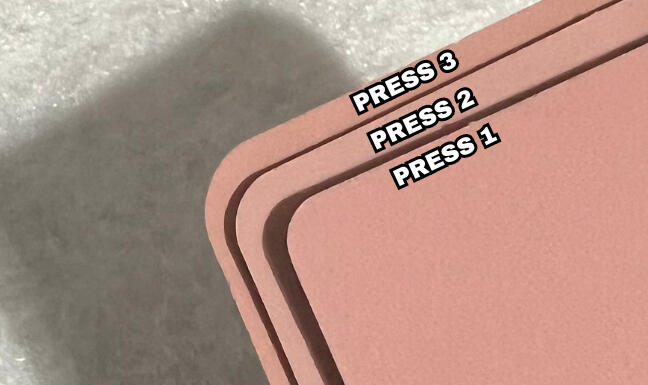
CORNERS:
The most significant difference between the 3 presses is the corner shape. Press 1 has the "tightest" or "sharpest" corners and press 3 has the "widest" and roundest corners. Press 2 is right in between them.
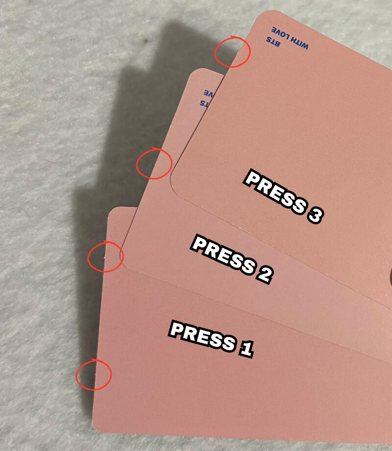
STEM CUTS:
Stem cuts are the little tabs you see on most photocards which can be on the edges or corners of photocards.
Press 1: 2 stem cuts on the top & bottom.
Press 2: 1 stem cut on the top & bottom in the middle.
Press 3: typically 1 stem cut on the top & bottom in the middle (this press may have inconsistent placements).
NOTE: See the red circles on the image showing the stem cuts. You can see that press 3 has one stem cut off center, hence the possible inconsistencies.
NOTE: if you are viewing on mobile pinch to zoom & If you are viewing on a computer increase your window zoom to 300%-400% on the picture below to clearly see the difference.
SPECIAL THANKS
@sugaftkook & @tinysoupdump for providing the 1st & 3rd press photocards.
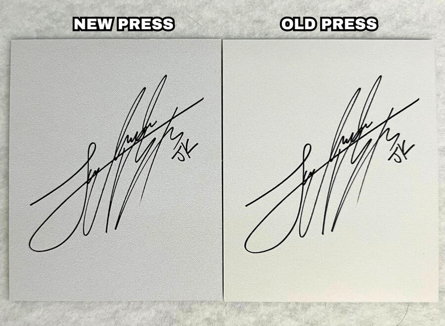
Skool Luv Affair Special Edition Photocard Presses
There are two presses for the SLA Special Edition photocards in circulation. This is because the album was initially released May 14, 2014 with a limited amount of copies. However the album was re-released on October 13, 2020 and is still available for purchase. There are significantly less first press photocards in circulation compared to the new press, so you may see them listed for sale at a higher price.
There are quite a few differences between first press and new press so I will go through all of the ones I've observed.
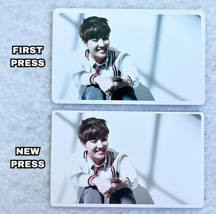
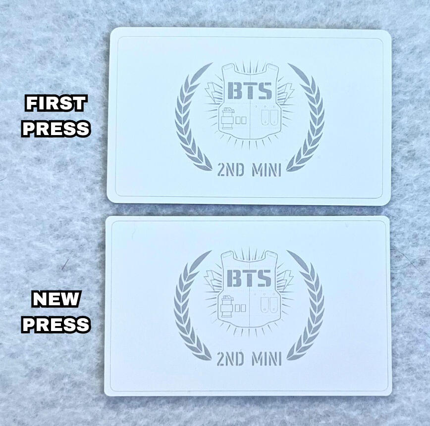
BORDERS:
The most well known difference is the thickness of the white border on the front.
First Press: Thick borders, even all the way around.
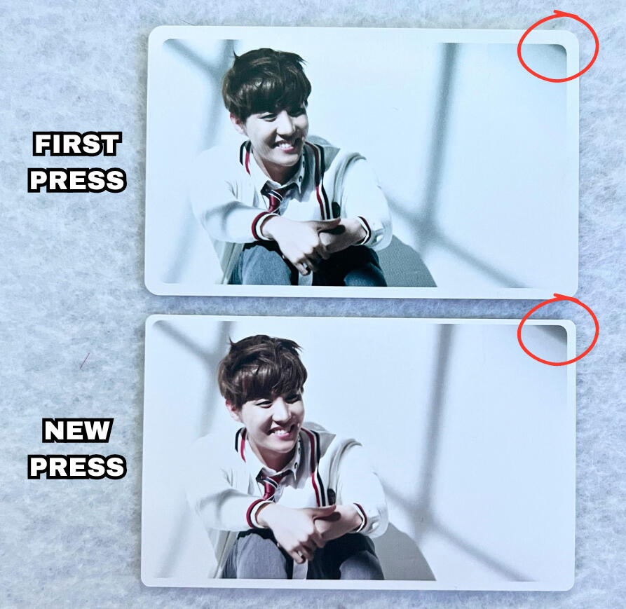
New Press: Thinner borders, often inconsistent and uneven, some sides will be thinner than others.CROPPING:
First press photocards are typically zoomed in slightly compared to new press, likely due to the border being thicker.
NOTE: refer to the red circles on the image showing the shadow in the top right corner being more cut off in the first press pc.
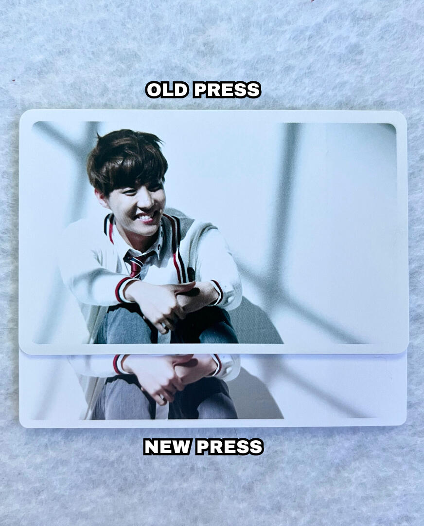
CROPPING:
First press photocards are typically zoomed in slightly compared to new press, likely due to the border being thicker.
NOTE: not circled, however if you look closely you'll notice Hobi's hand is closer to the border in the first press pc.TEXTURE:
Overall both presses maintain the same texture on the front and back, however the first press pc's image is printed slightly more crisp/clear creating a grainier printing pattern on the front.
NOTE: if you are viewing on mobile pinch to zoom & If you are viewing on a computer increase your window zoom to 300%-400% on the picture below to clearly see the difference.
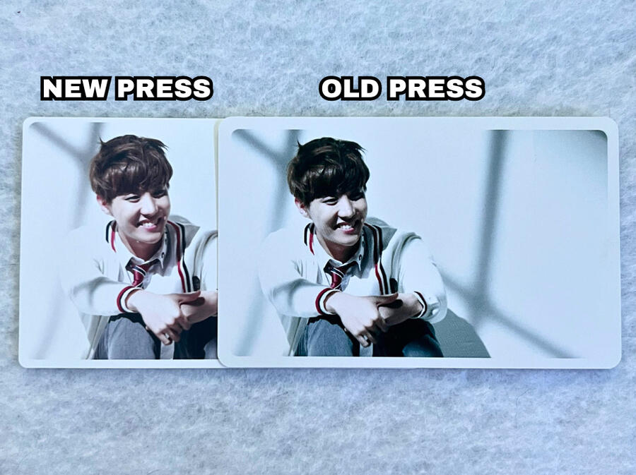
COLOR:
Another one of the more obvious differences is the coloring.
First Press: Overall a darker printing, cooler toned, more green/blue hues.
New Press: Brighter printing, warmer tones, more yellow/pink hues.
CORNERS:
First Press: rounder corners, even with border.
New Press: sharper corners, don't always align with the inconsistent borders.
TEXTURE:
First Press: grey line (border) is uniform and smooth.
New Press: grey line (border) is jagged/bumpy.
NOTE: if you are viewing on mobile pinch to zoom & If you are viewing on a computer increase your window zoom to 300%-400% on the picture below to clearly see the difference.
SPECIAL THANKS
@98hopekook for providing the old press photocard.
Young Forever: Dope Misprint
This is a well known misprint that occurs ONLY for Jimin's dope photocards. The bottom text on the back of the photocard is lighter and thinner. There was only one press for these photocards. ALL of Jimin's photocards will have this misprint. If he doesn't it is FAKE.
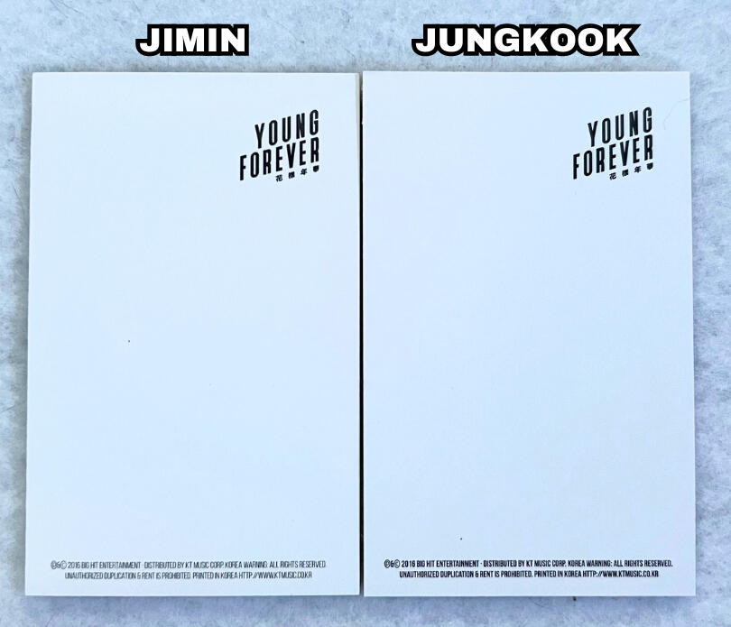
The text on the bottom of the back on Jimin's photocard is significantly lighter and thinner.
Jungkook's is bold and thick. Every other member will have text that looks like Jungkooks.
ONLY and ALL Jimin's dope photocards will have this misprint.
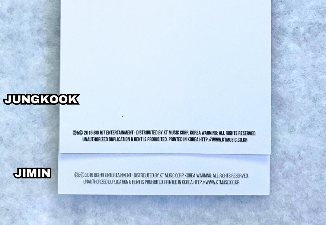
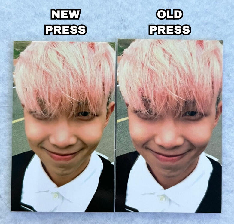
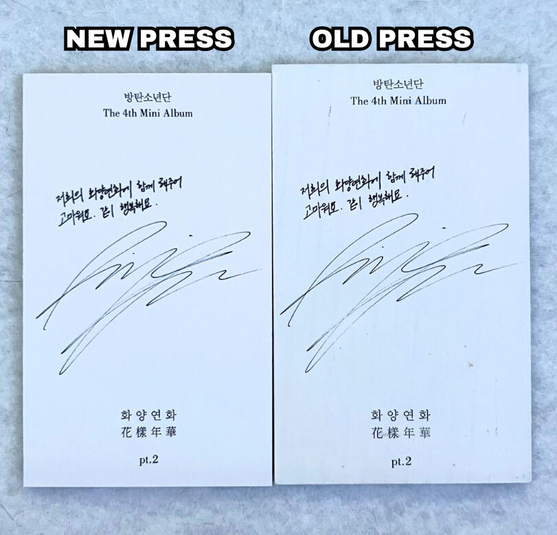
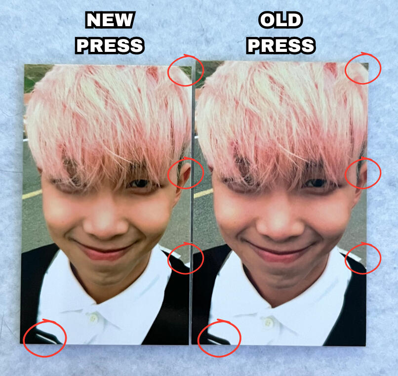
HYYH PT. 2 Photocard Presses
There are two main presses for The Most Beautiful Moment In Life (HYYH) PT. 2 photocards. The press differences are quite noticeable affecting the size, color and cropping of the photocard.
COLOR: The first visible difference in the presses is the coloring. The old press photocards have a more pink/cool tone to them, whereas the new press photocards have a more yellow/warm tone to them.
CROPPING:
Old press photocards are zoomed in slightly compared to new press. They seemed to refit the photo better in the new press photocards to fit more of the image on the PCs.
NOTE: refer to the red circles on the image showing the cropping differences in certain areas of the photocards.
If you struggle to notice the differences here they are written out using the old press PC:
• top right corner cut off more
• ear cut off more
• less black at the bottom showing
• white in the background cut off more
CROPPING:
The text on the back of old press photocards are zoomed in slightly compared to new press as well.
NOTE: refer to the red circles on the image showing that the text on the old press photocard is closer to the edges of the pc compared to the newer press.
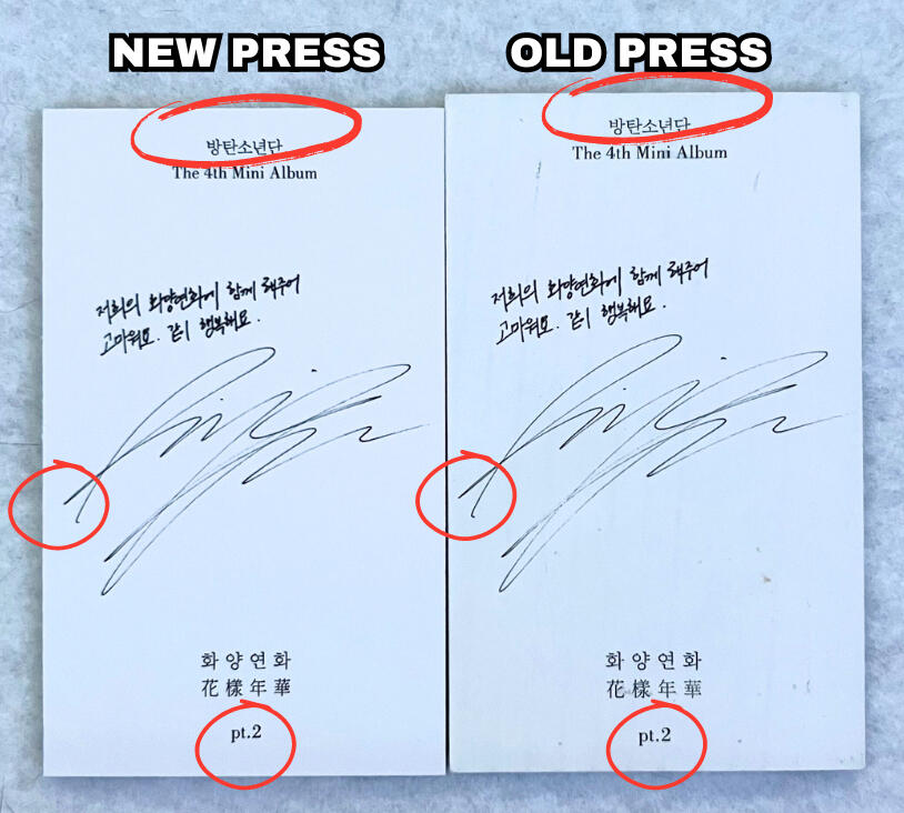
SIZE:
The old press photocards (underneath) are both taller and wider than the new press photocards (ontop).
NOTE: if you are viewing on mobile pinch to zoom & If you are viewing on a computer increase your window zoom to 300%-400% on the picture below to clearly see the difference.
SPECIAL THANKS
@_bangtanswag_ for providing the old press photocard.
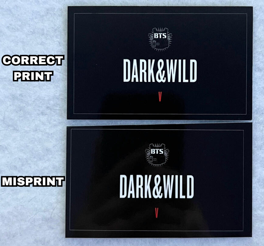
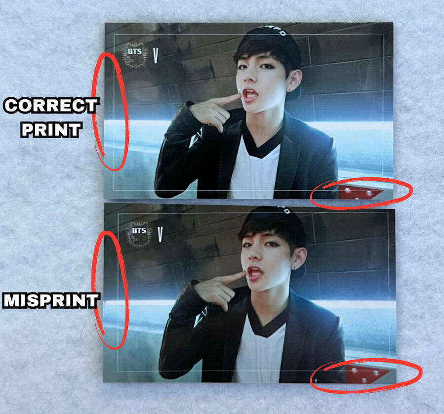
Dark & Wild Misprint
Some Dark & Wild photocards may have uneven/off center borders on the front and back. This is a fairly common misprint.
DISCLAIMER: The misprinted photocard used in the images below also has a defect. The top edge of the photocard has been cut slanted which is a separate issue to the misprint itself but may have caused the severity of the misprint in this specific instance.
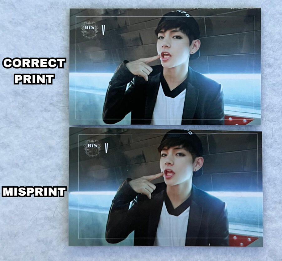
BORDERS:
The thin white borders on the front and back of the photocards on misprinted photocards are uneven appearing closer or further from the edge of the photocard on certain sides.
NOTE: refer to the red circles on the image below showing some of the differences.
If you struggle to notice the differences circled here they are written out using the misprinted pc:
• on the front, the left & bottom borders are further from the edge.
• on the back, the left border is closer to the edge while the right border is further away from the edge.
NOTE: if you are viewing on mobile pinch to zoom & If you are viewing on a computer increase your window zoom to 300%-400% on the picture below to clearly see the difference.
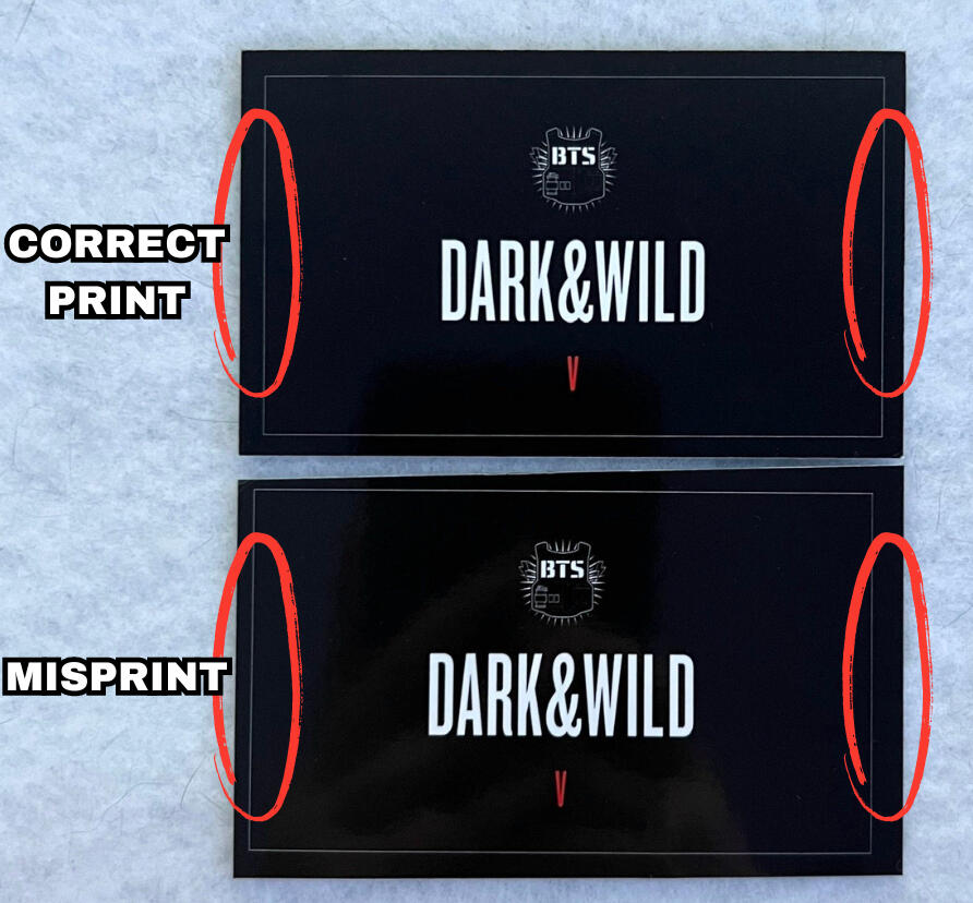
BORDERS:
In the images below you can see the border on the top side is much closer to the edge on the misprinted photocard compared to the correctly printed pc. HOWEVER, if you remember the disclaimer above, this misprint also has a severe defect with an uneven cut. This is likely the cause of this difference being so obvious.
SPECIAL THANKS
@Jungkookiesv84 for providing the misprinted photocard.
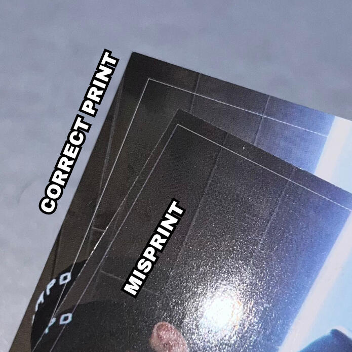
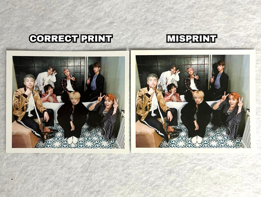
Proof Standard Misprint
The Proof standard album photocards have a known misprint where the image printing on the card is misaligned causing a blunt cut-off at the bottom of the card and shows the start of a new photocard beneath it.
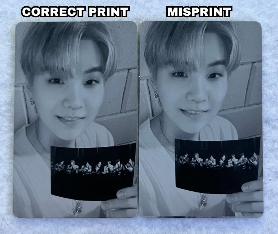
Refer to the red circle on the image to see a clearer example of the misprint. This can happen to any member's photocard. Additionally, the severity of this misprint is also inconsistent. Some cards may have a cutoff that is closer/further from the bottom edge.NOTE: if you are viewing on a computer increase your window zoom to 300%-400% on the picture below to clearly see the difference
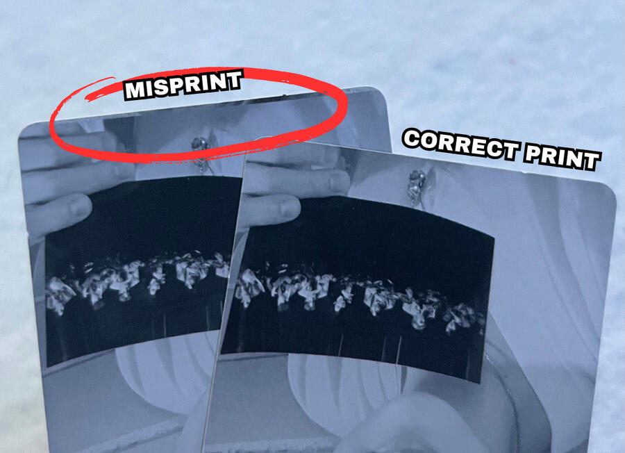
CROPPING/ALIGNMENT:
Front: The misprinted photocard is shifted up, which cuts off the top of his hair a bit but also displays more of his hand on the bottom.
NOTE: refer to the red circle on the image below showing the difference in Yoongi's hand.
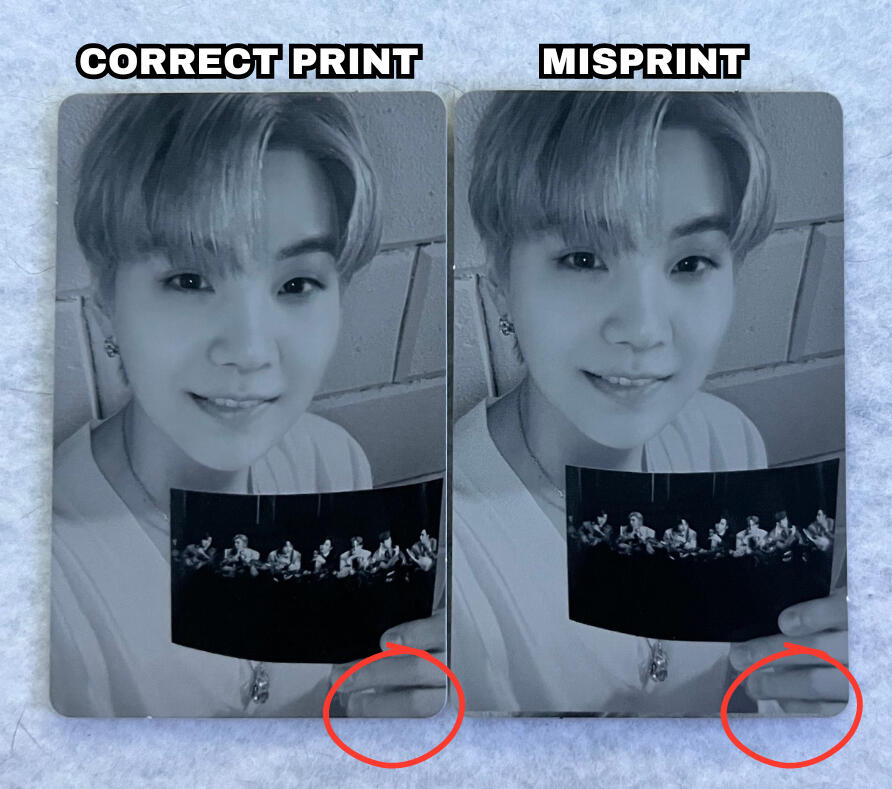
Back: Once again, the misprinted photocard is shifted up, making the proof logo on the back off center.
NOTE: refer to the red measuring lines on the image below showing how the logo on the misprinted photocard is not centered (too far up).
SPECIAL THANKS
@soopy.7 for providing the misprinted photocard.
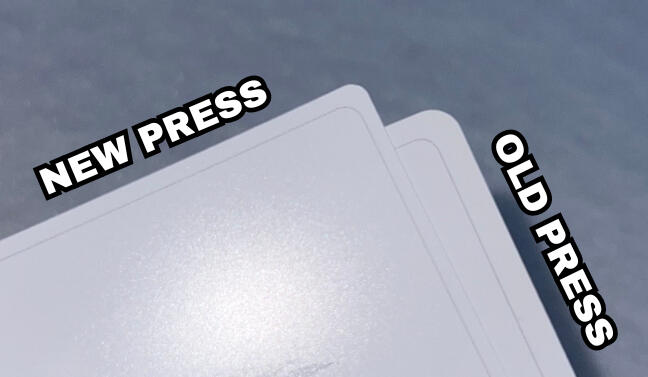
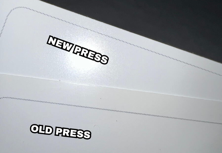
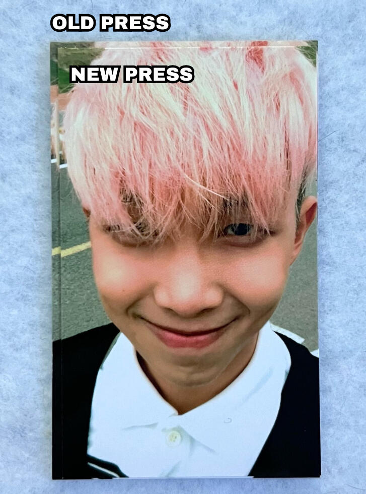
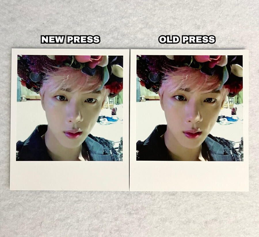
Young Forever Photocard Presses
The Young Forever album polaroids have 2 main press types which mainly impacts the coloring/quality and texture. It is important to note that the young forever photocards can have many slight color variations overall for both the front and back but there are mainly two presses.
COLORING/QUALITY:
FRONT:
The old press photocards are more vibrant/saturated and crisp, whereas new press photocards are less vibrant/saturated and appear more "foggy" or "hazy".
BACK:
Old press photocards have a more white and bright color on the back, whereas new press photocards have a darker grey coloring.
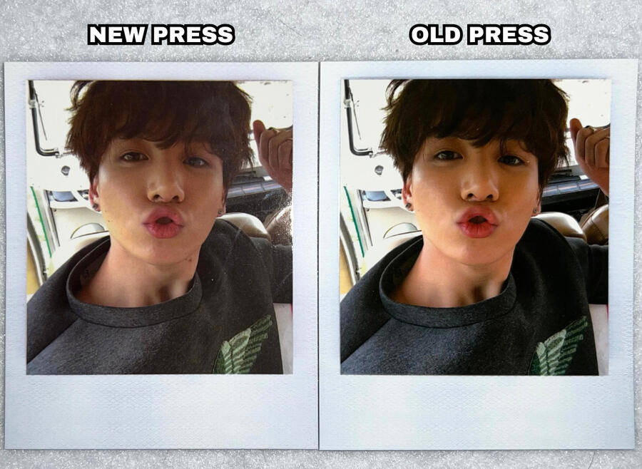
TEXTURE:
As seen in the video below, the new press photocards are comparatively more matte than the old press photocards which tend to "shine" a bit more when under direct light.
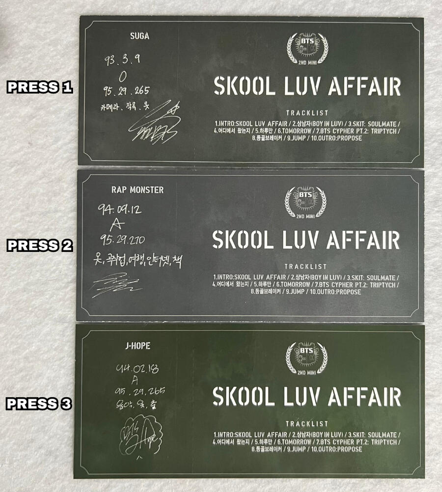
Skool Luv Affair Photocard Presses
Skool Luv Affair (SLA) has 3 main press types that is distinguishable mainly by the texture.
COLORING:
The Skool Luv Affair photocards have significant coloring differences, as seen in the pictures, however, these photocards notoriously have inconsistent coloring mostly regarding the tone/temperature spanning all presses and versions (arms out vs. arms in). Many cards of the same press type may have different shades of green on the back, as well as a more blueish tone on the front.
Because of this, the only main coloring difference that is consistent among different press types is the saturation/vibrance of the photocard (mainly the back).
Press 1 & 2 typically have a more dull/faded/washed out coloring to them, compared to press 3 that has a more vibrant and bold coloring.
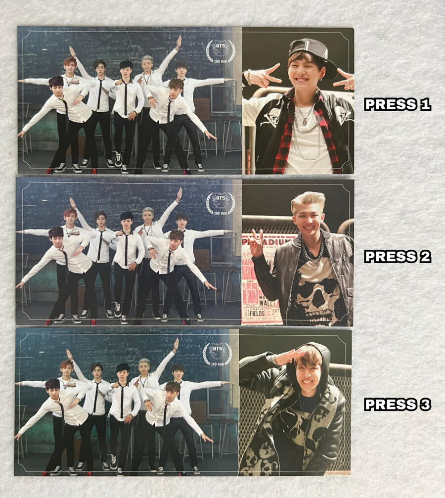
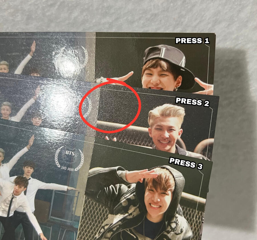
TEXTURE:
The most significant difference in the press types is the texture of the front and backs of the photocards.
All 3 press types have a glossy front, however, press type 2 has a slightly more 'grainy' or 'pebbly' look to it.
NOTE: refer to the red circle on the image below showing the more 'rough/pebbly' texture on the RM (press 2) photocard.
NOTE: if you are viewing on mobile pinch to zoom & If you are viewing on a computer increase your window zoom to 300%-400% on the picture below to clearly see the difference.
TEXTURE:
The texture on the back of the photocards differs between all 3 press types.
Press 1: Smooth and shiny matte back.
Press 2: Grainy matte back.
Press 3: Fully glossy back.
NOTE: refer to the video below to clearly see the texture differences.
SPECIAL THANKS
@93vantaes for providing all 3 of these photocards.
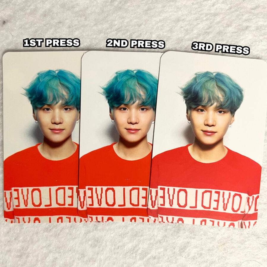
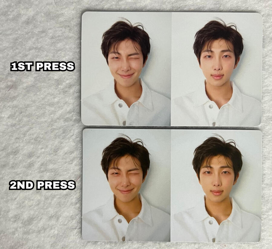
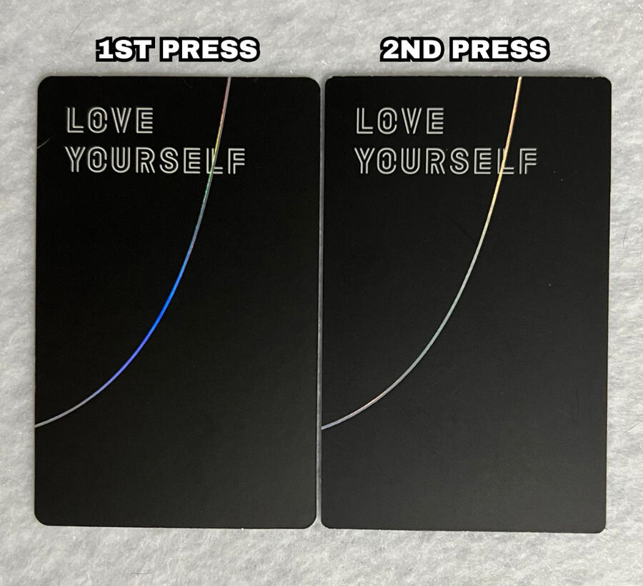
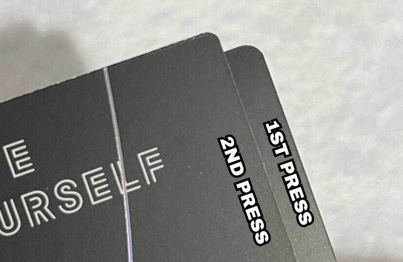
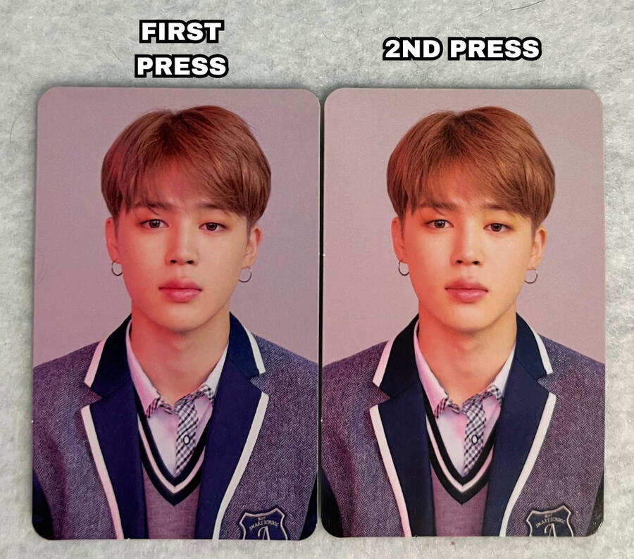
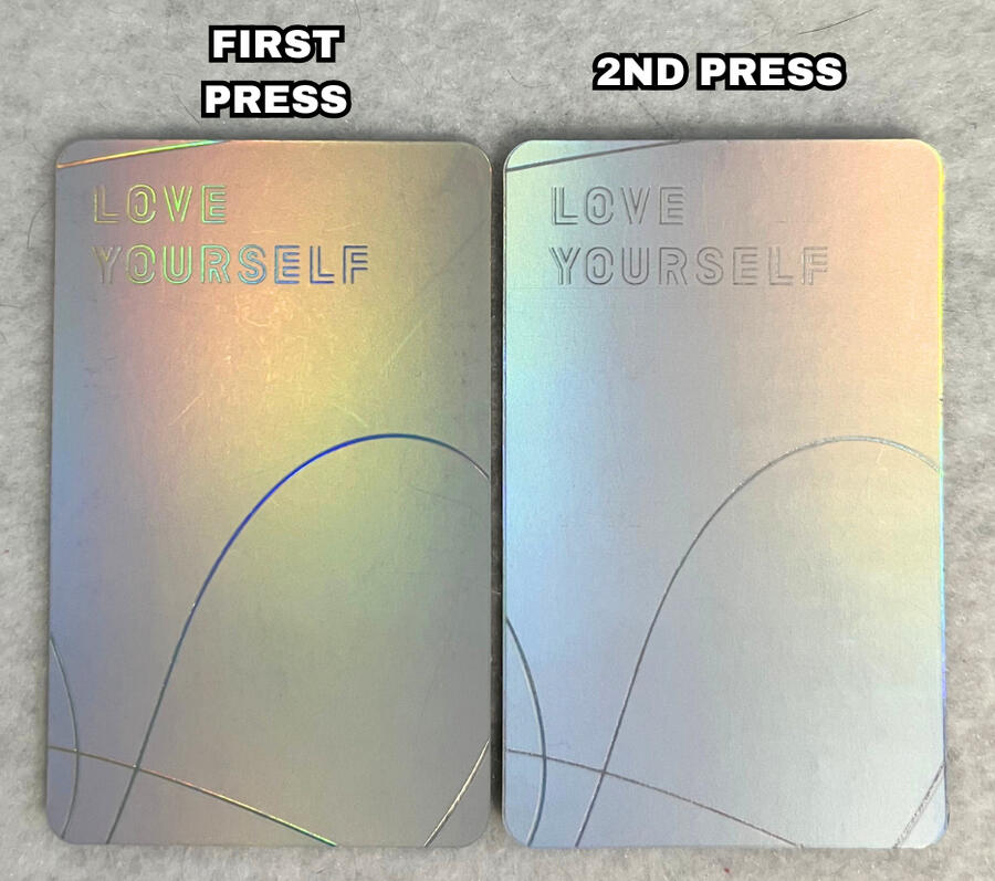
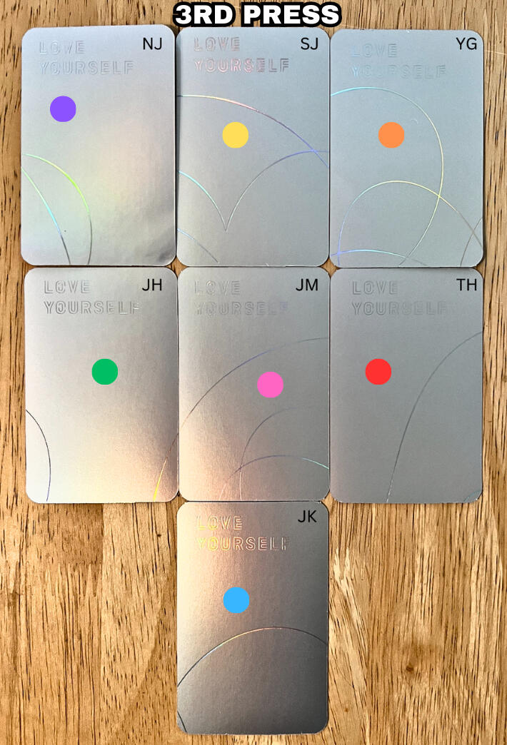
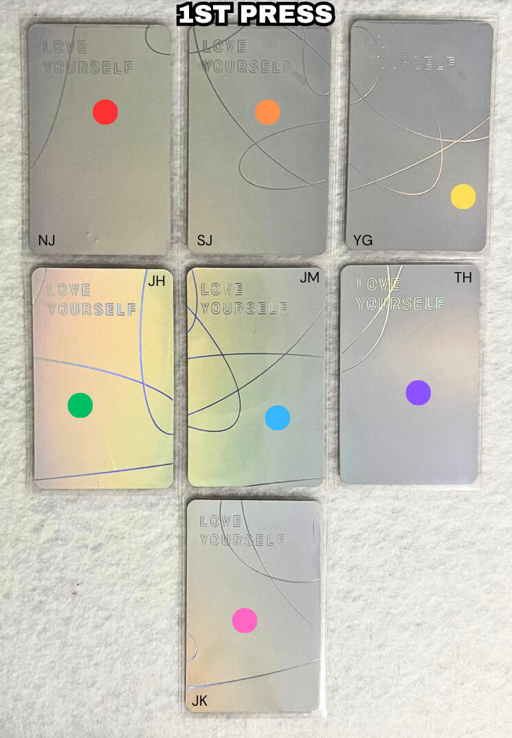
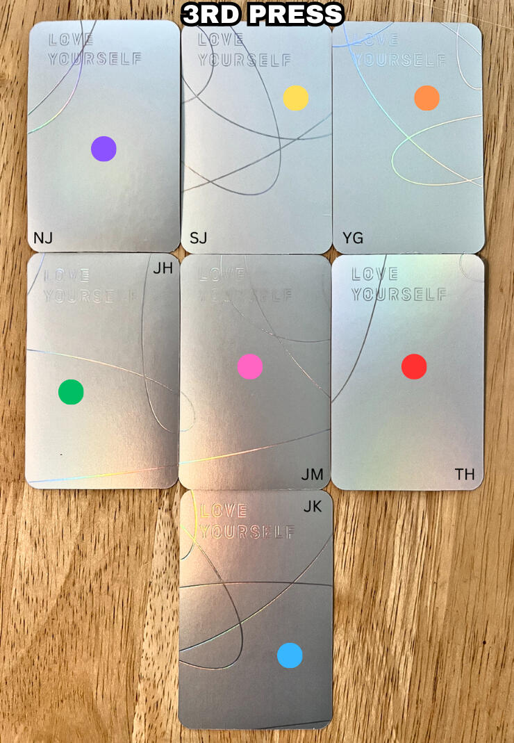
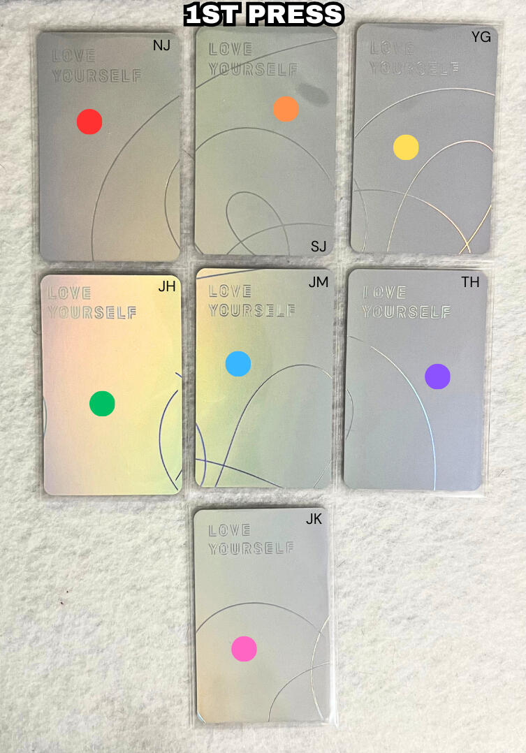
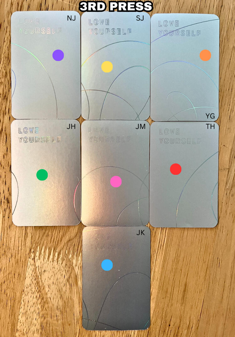
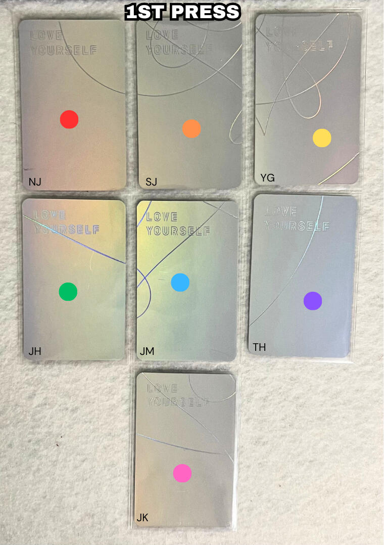
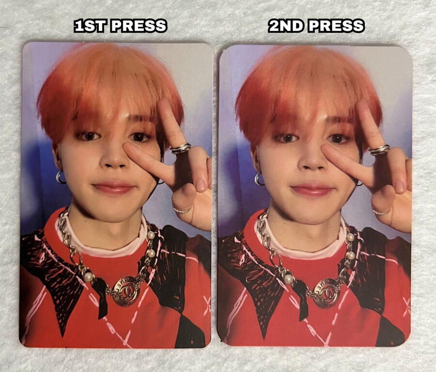
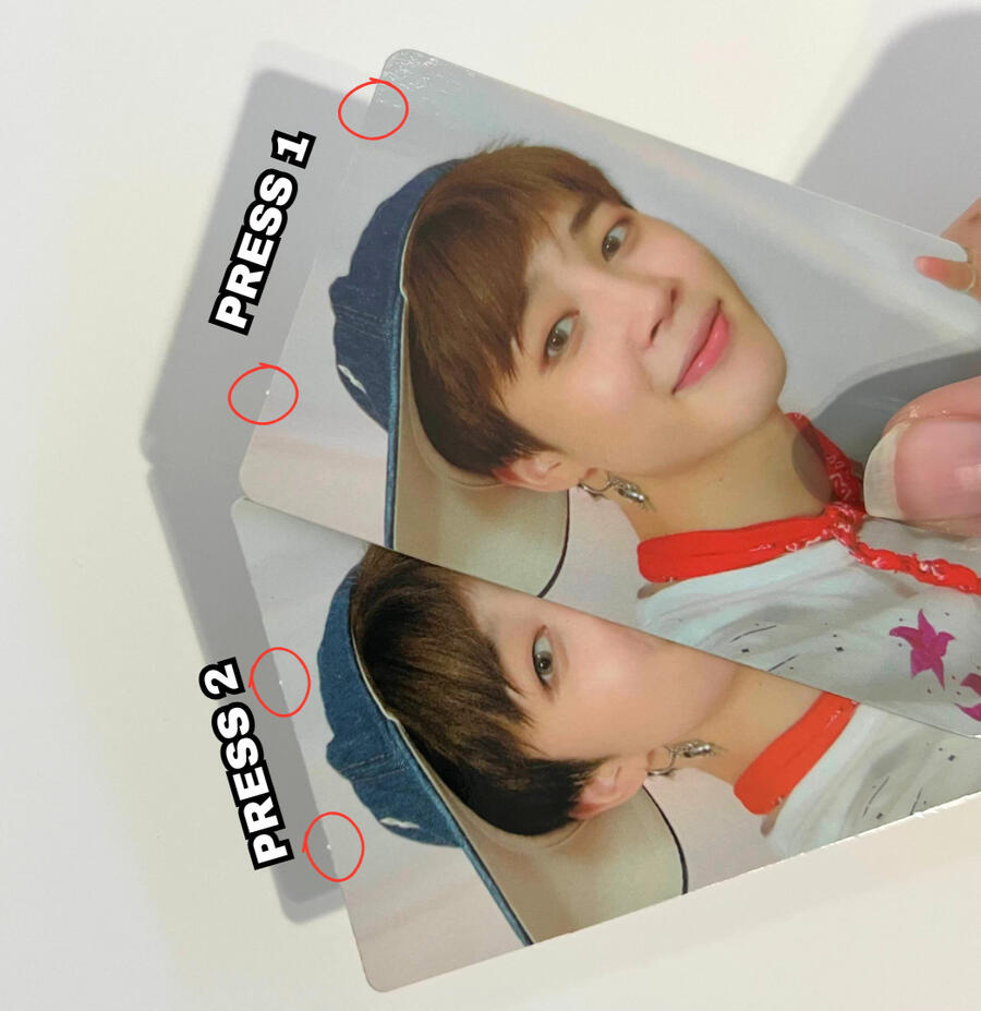
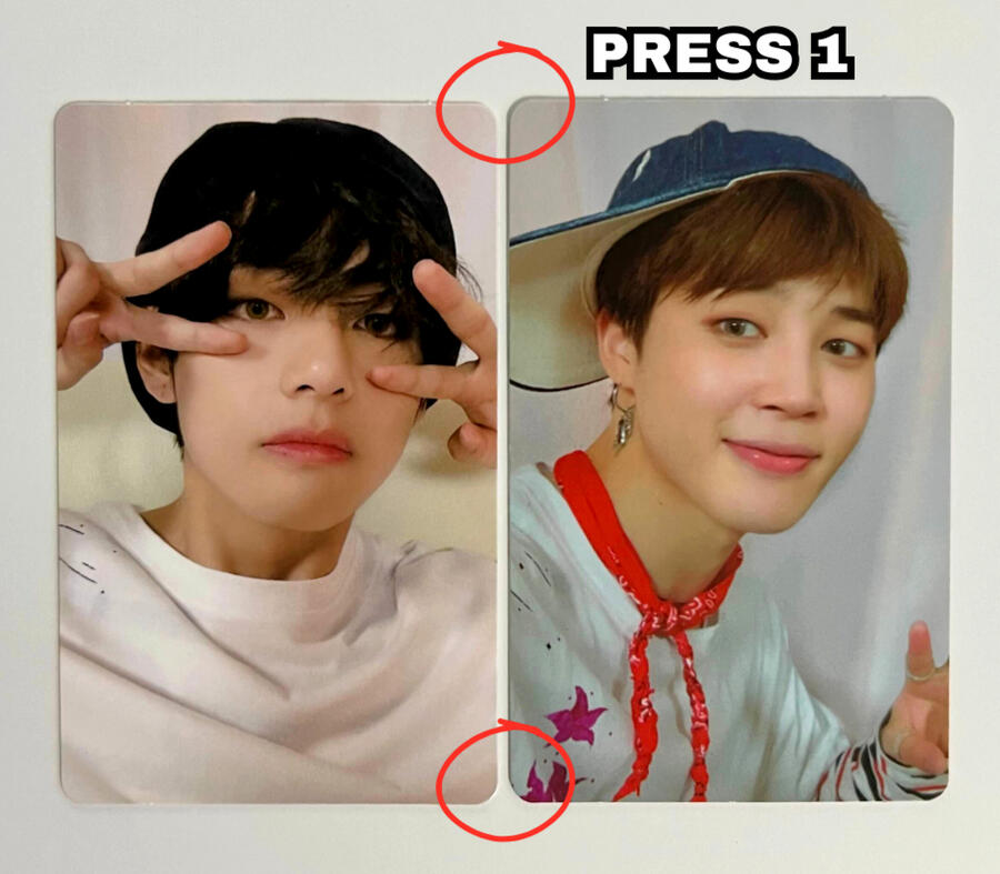
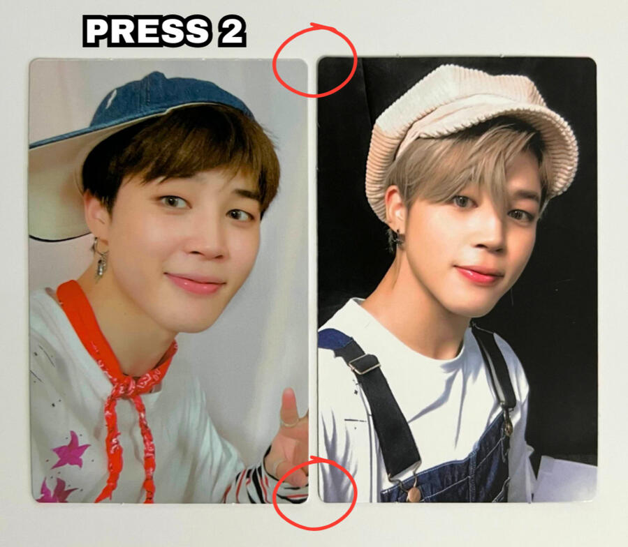
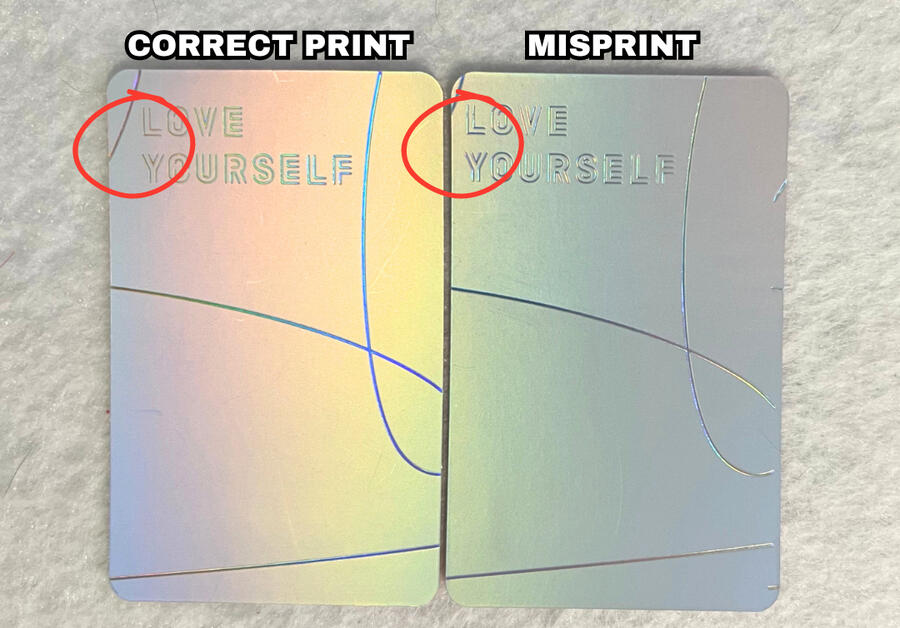
Love Yourself: Her Photocard Presses
Love Yourself: Her has 3 main press types. The 2nd & 3rd presses were a result of HYBE switching to YG PLUS for manufacturing.
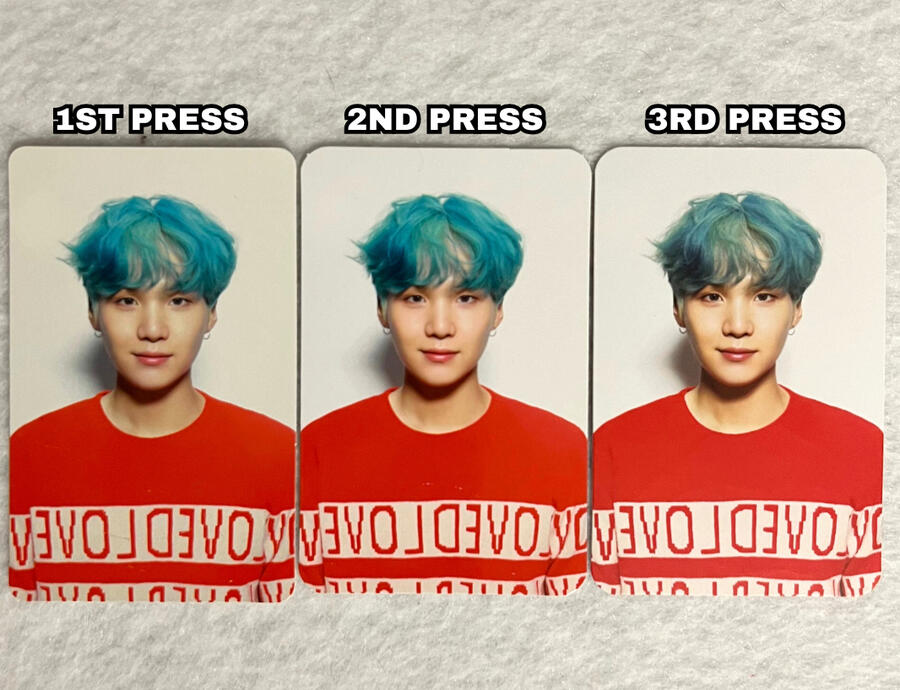
COLOR:
It is important to note that color variations aren't always a viable method of determining press types as they can have inconsistencies within one press, however I would still like to point out the differences.
In the image, you can see that the 2nd press pc is more 'pink' toned, making Suga's skin tone look more balanced/natural, whereas the 1st and 3rd presses are more 'yellow' toned.
Both 2nd and 3rd press have a brighter white background on both the front and the back (this may only apply to this version, version V). However, due to age, the 1st press photocard is more yellow than it would normally be.
NOTE: if you are viewing on mobile pinch to zoom & If you are viewing on a computer increase your window zoom to 300%-400% on the picture below to clearly see the difference.
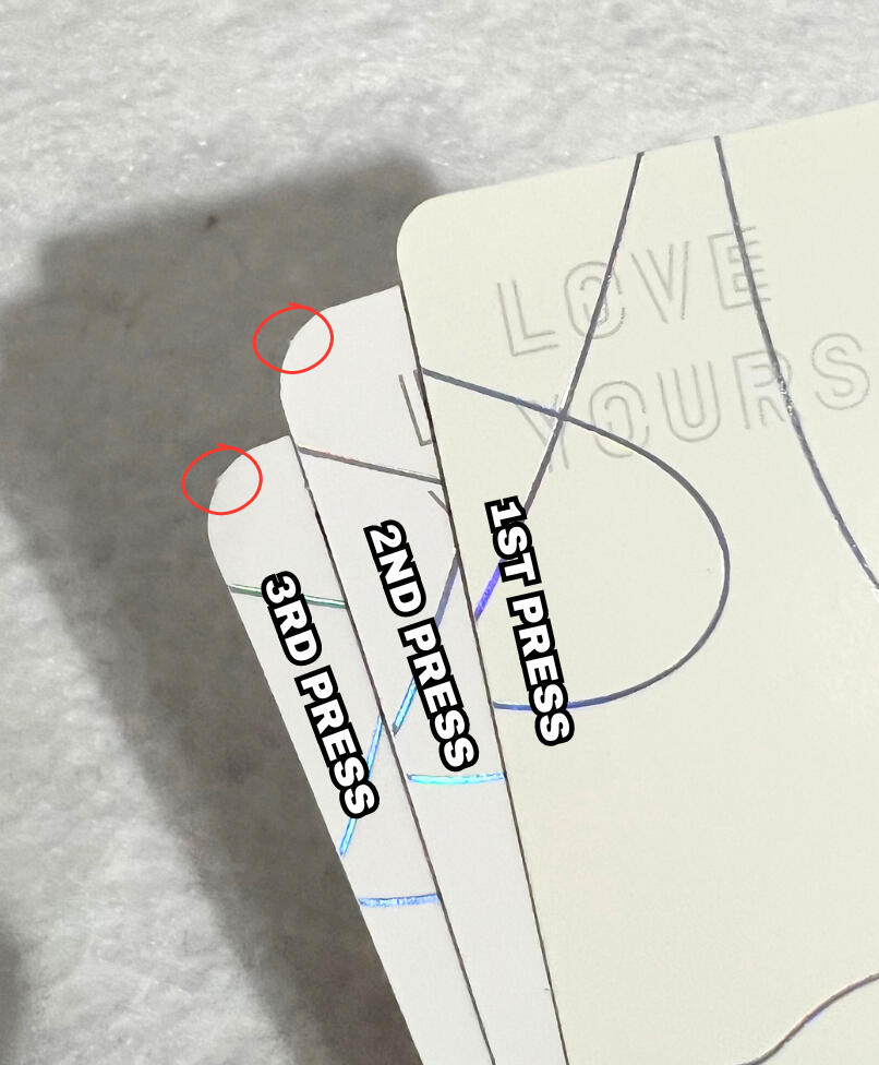
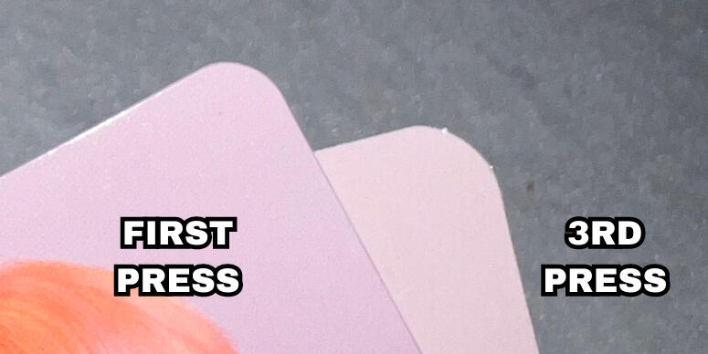
CORNERS:
The most significant difference between the 3 presses is the corner shape. Press 1 has the "tightest" or "sharpest" corners and both 2nd and 3rd presses have matching corners that are much rounder.
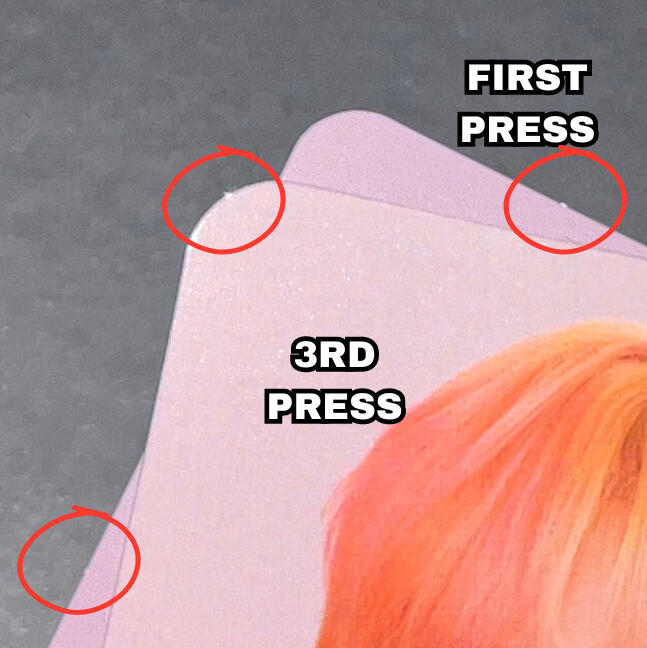
STEM CUTS:
Stem cuts are the little tabs you see on most photocards which can be on the edges or corners of photocards.
1st press photocards have multiple stem cuts on the tops & bottoms of the photocards (and occasionally the sides). 2nd & 3rd press photocards always only have 1 stem cut in each corner.
NOTE: Refer to the red circles on the image below indicating the stem cuts on the 2 newer presses.
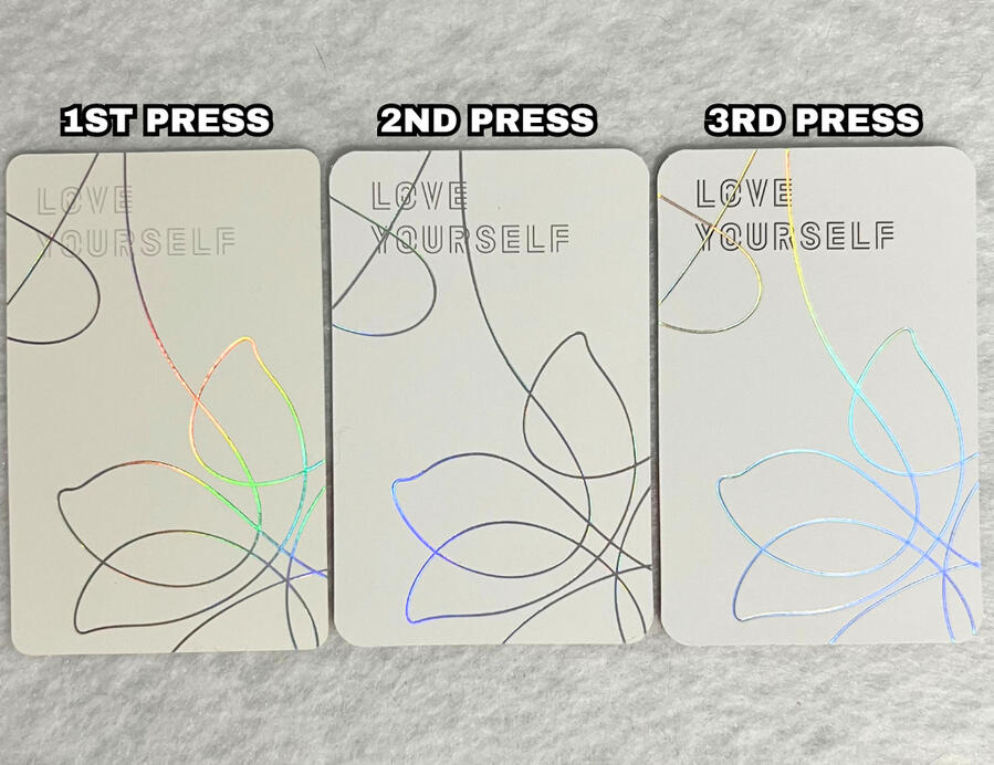
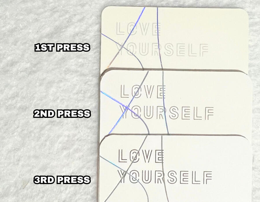
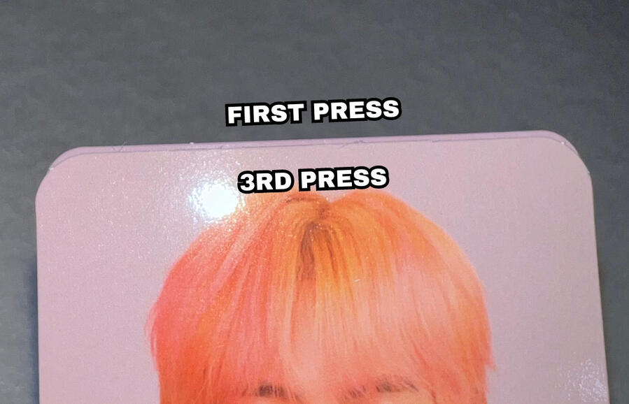
TEXT:
One other significant difference between the 3 presses is the "LOVE YOURSELF" text on the back of the photocard.
With each press types, the text gets darker, bolder and more visible. 1st press being the lightest and 3rd press being the darkest.
NOTE: if you are viewing on mobile pinch to zoom & If you are viewing on a computer increase your window zoom to 300%-400% on the picture below to clearly see the difference.
TEXTURE:
1st Press: Glossy front, shiny matte back.
2nd Press: Glossy front, fully matte back.
3rd Press: Matte front, smoother matte back.
NOTE: Please watch the video below to see the texture differences.
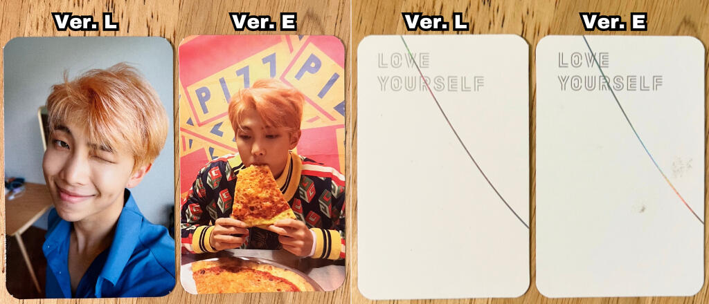
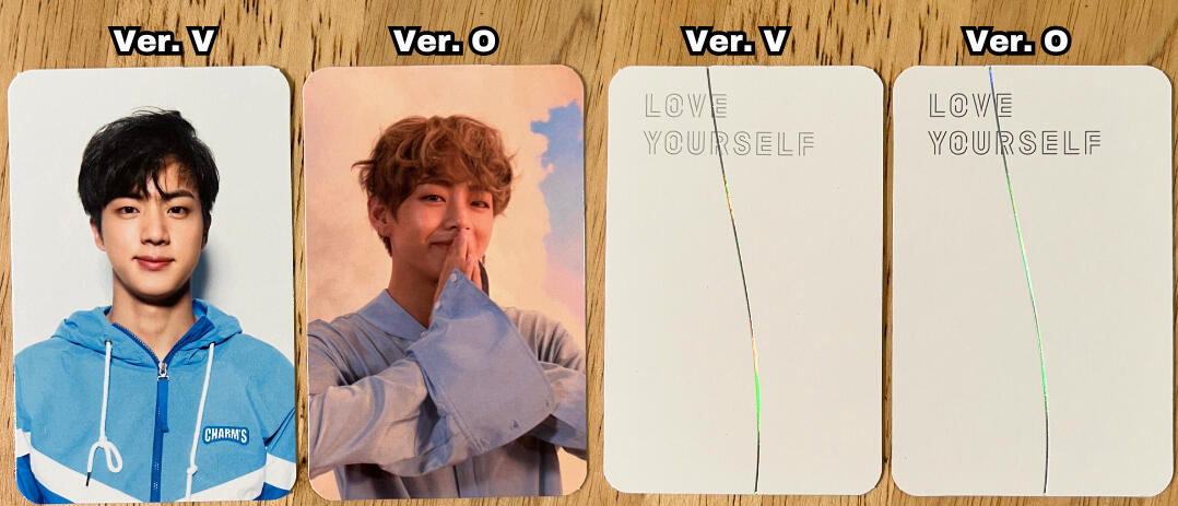
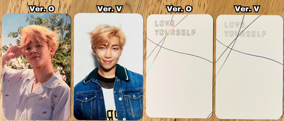
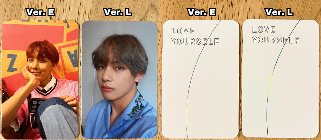
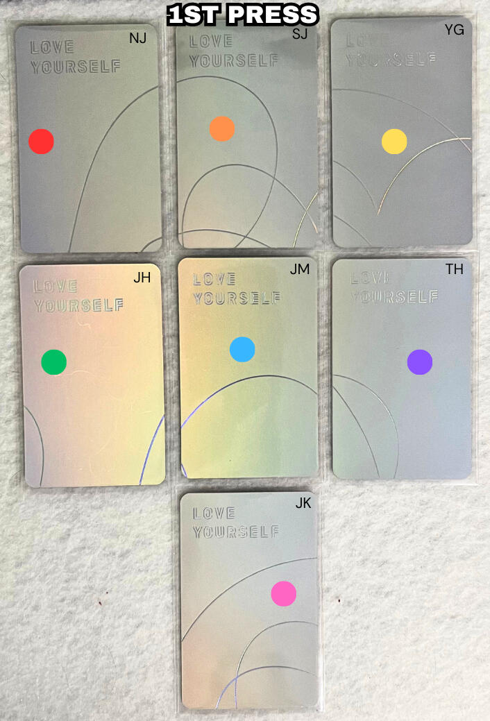
LINE DESIGN/PATTERN:
For majority of the LY: Her photocards, the line design on the back is consistent among all 3 press types, however there are a couple of cards where the line design on the back of 2nd & 3rd press photocards is different than 1st press.As you can see in the images below, there are 4 photocards with different line designs.
RM (NJ) Her L
Jin (SJ) Her V
RM (NJ) Her V
J-hope (JH) Her E
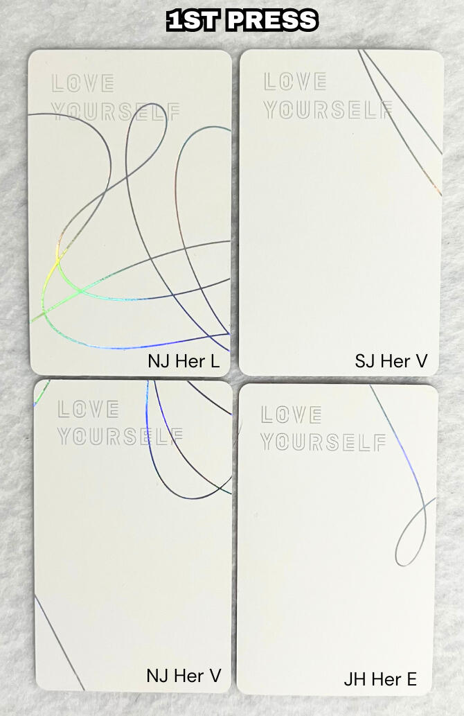
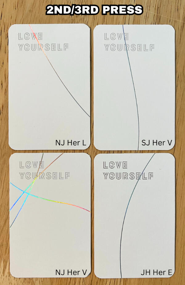
LINE DESIGN/PATTERN:
The four 2nd/3rd press photocards that have a different design on the back compared to their 1st press equivalents share the same design with another member/versions design.
2nd/3rd press RM ver. L design = RM ver. E design (same design for all 3 presses)
2nd/3rd press JIN ver. V design = V ver. O design (same design for all 3 presses)
2nd/3rd press RM ver. V design = JIMIN ver. O design (same design for all 3 presses)
2nd/3rd press J-HOPE ver. E design = V ver. L design (same design for all 3 presses)
SPECIAL THANKS
@93vantaes & @Jiyoon_goyangi for providing the 2nd & 3rd press photocards.
Love Yourself: Tear Photocard Presses
Love Yourself: Tear has 2 main press types that have quite minimal differences.
COLORING:
There are obvious color differences between 1st press and 2nd press photocards. 1st press looks more well balanced regarding tone, whereas the 2nd press seems to have a more saturated, darker, and warmer/yellow tone. however the brightness and tone of the cards can vary from member to member as well as from version to version so this is an observation to be aware of, but may not always determine press type.
CORNERS:
The LY: Tear presses have different corner shapes. 1st press has rounder corners, whereas 2nd press has "tighter" or "sharper" corners.
NOTE: if you are viewing on mobile pinch to zoom & If you are viewing on a computer increase your window zoom to 300%-400% on the picture below to clearly see the difference.
SPECIAL THANKS
@93vantaes for providing the 1st press photocard.
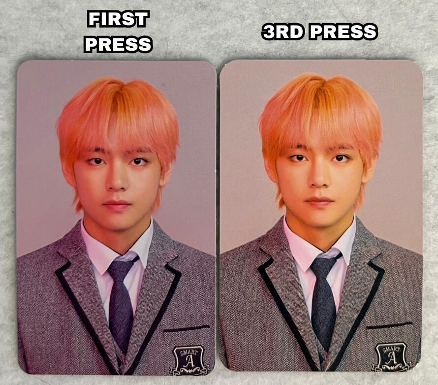
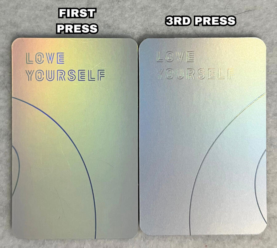
Love Yourself: Answer Photocard Presses
Love Yourself: Answer has 3 main press types. The first two are very similar, wheras the third press type has more dramatic differences. The third press was a result of HYBE switching to YG PLUS for manufacturing.
COLORING:
The 1st press answer photocards are typically a bit darker in color on both the front and back, wheras the 2nd press cards are brighter. However the brightness/tone of the cards can vary from member to member as well as from version to version so this is an observation to be aware of, but may not always determine press type.
HOLOGRAPHICS:
1st press photocards tend to have a stronger indentation regarding the "LOVE YOURSELF" text and holographic lines compared to 2nd press.
2nd press photocards typically shine more and brighter under direct lighting compared to 1st press cards, that can seem slightly more dark/dull.
COLORING:
There are color differences between 1st press and 3rd press photocards. 1st press being darker and more 'pink' toned and 3rd press being brighter and more 'yellow' toned. However the brightness and tone of the cards, especially 3rd press can vary from member to member as well as from version to version.
HOLOGRAPHICS:
Both 1st and 3rd press photocards typically have a deeper holographic indentation on the back compared to 2nd press.
However similar to 2nd press cards, the 3rd press photocards typically shine more and brighter under direct lighting compared to 1st press cards which can seem slightly more dark/dull.
LINE DESIGN/PATTERN:
The line design on the back of 3rd press photocards is different than the other two presses for all members except J-hope.
CORNERS:
Whereas 1st and 2nd press photocards have the same corner shape, 3rd press photocards are much more round.
STEM CUTS:
Stem cuts are the little tabs you see on most photocards which can be on the edges or corners of photocards.
3rd press photocards have a stem cut on each corner of the photocard.
1st and 2nd press cards have stem cuts on the top and bottom as well as sometimes on the edges.
NOTE: Refer to the red circles on the image below indicating the stem cuts
SIZE:
The 3rd press photocards are the smallest in height compared to both the 1st and 2nd presses.
THICKNESS:
3rd press photocards are usually thinner than the other two presses with a strong holographic indentation on the back which is visible from the front of the card.
NOTE: Please watch the video below for an example.
LINE DESIGN/PATTERN:
The line design on the back of 3rd press photocards is different than the other two presses. There is a consistent pattern among all versions of the answer photocards regarding the design. Each 3rd press member has the same design as another members 1st and 2nd press designs.
THE PATTERN:
Jin's original design matches Suga's 3rd press.
Suga's original design matches Jin's 3rd press.
J-hope's line design remains the same across all 3 presses.
RM's original design matches V's 3rd press design.
Jimin's original design matches Jungkook's 3rd press design.
V's original design matches RM's 3rd press.
Jungkook's original design matches Jimin's 3rd press.
NOTE: Looking at the pictures below, use the color guide which shows which members designs match.
SAME COLOR=SAME DESIGN
Love Yourself: Answer Ver. S
Love Yourself: Answer Ver. E
Love Yourself: Answer Ver. L
Love Yourself: Answer Ver. F
SPECIAL THANKS
@93vantaes for providing the pictures of the 3rd press photocards.
Map Of The Soul: Persona Photocard Presses
Map Of The Soul: Persona has 2 main press types as a result of HYBE switching to YG PLUS for manufacturing.
COLORING:
The back of the photocards is where the main color difference occurs between 1st and 2nd press persona photocards. 1st press photocards have a much darker shade of pink, whereas 2nd press is much brighter/lighter.
NOTE: The reference photocards being used are MOTS: Persona Version 4. The pink coloring difference may be different for other versions.
CORNERS:
The most significant difference between the 2 presses is the corner shape. 1st press has "tighter" or "sharper" corners and 2nd press has much rounder corners.
STEM CUTS:
Stem cuts are the little tabs you see on most photocards which can be on the edges or corners of photocards.
1st press photocards typically have two types of stem cut patterns. They may have two stem cuts on both the top & bottom of the photocard or they may have 1 stem cut on each edge. 2nd press photocards always only have 1 stem cut in each corner.
NOTE: Refer to the red circles on the image below indicating the stem cuts
SIZE:
The 2nd press photocards are smaller in height compared to 1st press cards.
MISC:
Another observation I have made for the 3rd press photocards, that runs throughout multiple photocard presses made with YG PLUS manufacturing (occurs with LY: Her photocards as well) is the appearance of a cut on one edge of the photocard (typically the top). It is NOT a stem cut.
SPECIAL THANKS
@93vantaes for providing the 3rd press photocard.
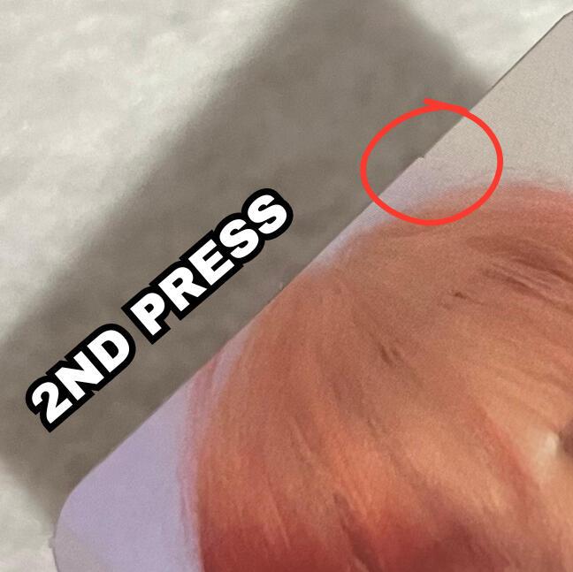
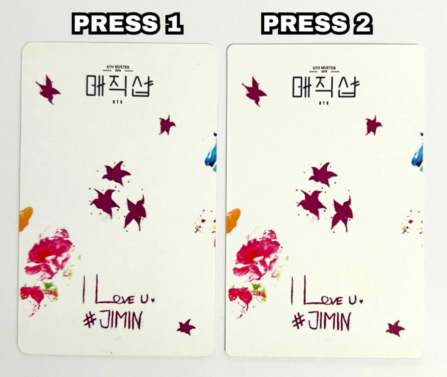
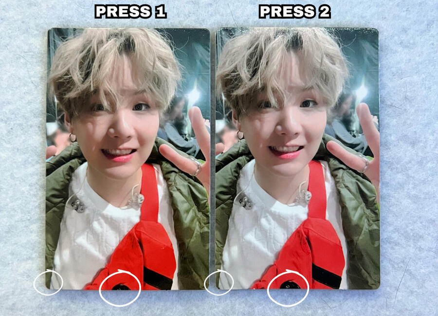
5th Muster DVD Photocard Presses
There are two presses for Jimin's 5th Muster DVD photocards ONLY. All other members only have ONE press and should look more like press 1 Jimin. The main press differences are the corner shape, stem cut placements and coloring.
COLORING:
Press 2 is noticeably brighter than press 1. While there is a slight difference in the brightness of the backside, it's much more minimal compared to the front.
NOTE: Coloring differences alone are not always an indication of different presses as printing inconsistences can occur. Additionally minor tone differences may also occur due to age. Photocards, especially ones with a lot of white, tend to yellow as they get older.
ADDITIONAL QUALITIES:
There should be NO differences between press 1 and press 2 for the following attributes:
• Texture
• Image quality/clarity
• Size
• Image zoom
• Font/text quality
Those qualities should be the same between both presses.
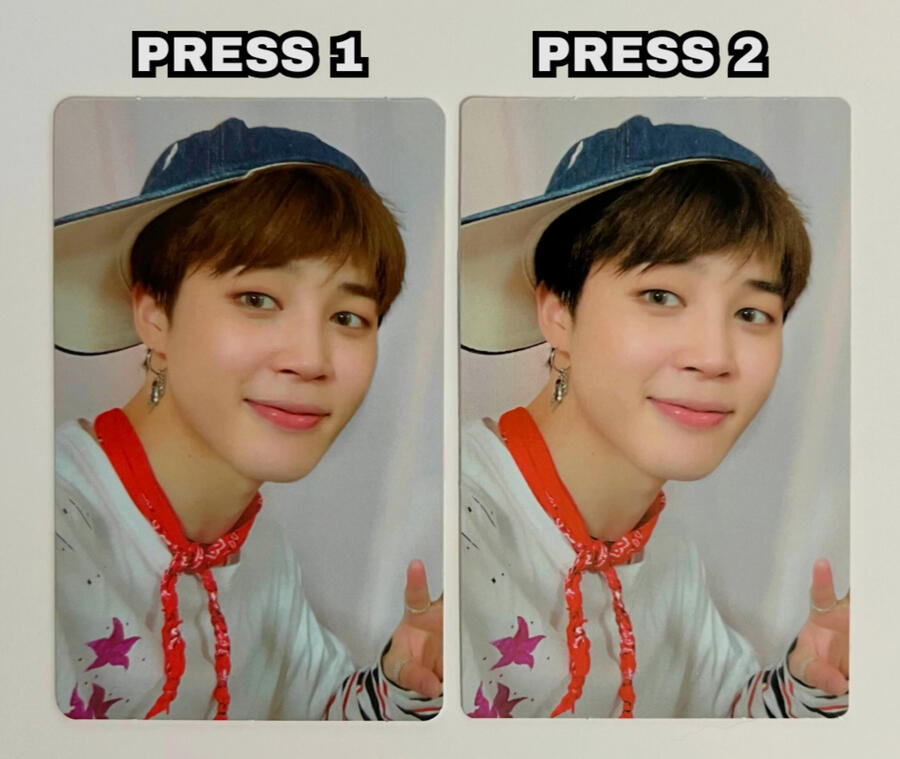
CORNERS:
Press 1 Jimin has rounder corners compared to press 2, which is more 'sharp/tight'.NOTE: if you are viewing on mobile pinch to zoom & If you are viewing on a computer increase your window zoom to 300%-400% on the picture below to clearly see the difference.
STEM CUTS:
Stem cuts are the little tabs you see on most photocards which can be on the edges or corners of photocards.
Both Press 1 and press 2 photocards have stem cuts on the top and bottom edges.
However, the stem cuts are further apart for press 1 compared to press 2.
NOTE: Refer to the red circles on the image below indicating the stem cuts.
NOTE: if you are viewing on mobile pinch to zoom & If you are viewing on a computer increase your window zoom to 300%-400% on the picture below to clearly see the difference.
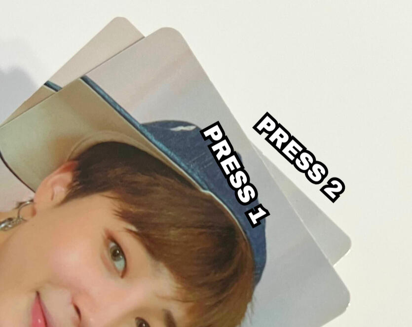
EXTRA COMPARISONS:
Jimin is the only member who has two presses for the 5th Muster DVD photocards. Here are two comparisons.
PRESS 1:
Press 1 Jimin has matching rounder corners and generally matching wide stem cut placements to every other members 5th Muster DVD equivalent.
NOTE: Refer to the Taehyung and Press 1 Jimin comparison image below.PRESS 2:
Press 2 Jimin has matching 'sharper/tighter' corners and generally matching close stem cut placements to the Fanmeeting Vol. 5 DVD photocards.
NOTE: Refer to the Jimin FMV5 and Press 2 Jimin comparison image below.NOTE: if you are viewing on mobile pinch to zoom & If you are viewing on a computer increase your window zoom to 300%-400% on the picture below to clearly see the difference.
ADDITIONAL INFO
Because this difference only applies to Jimin's 5th Muster DVD photocards, it can very easily be seen as a misprint instead of a different press. Thinking of it in that way, I would say that press 1 is the "correct" print because it matches the other members in this photocard set, while press 2 is the "misprint".
However, I decided to classify this as a press difference because press 2 is noticeably MUCH more common than press 1 Jimin. While I am unsure of the exact production ratio between them, it appears as though press 1 Jimin was printed much less than press 2. so while press 2 may technically have been a misprint, it has become the more 'standard' and common version of Jimin's card.
SPECIAL THANKS
@howyouuu_likethat for providing press 1 Jimin.
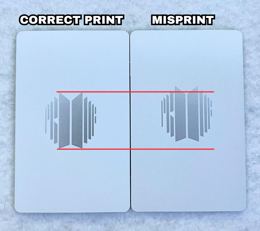
Wings Misprint
A fairly common misprint on the Wings album photocards is where the logo and "WINGS" text on the back of the group photocard is printed upside down.
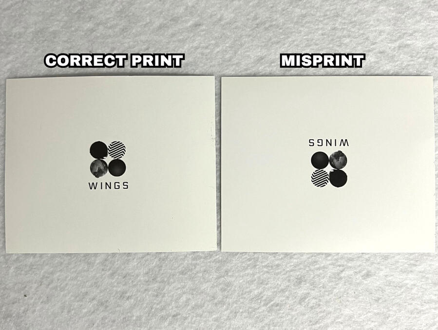
The video below shows a more clear view of this misprint.
SPECIAL THANKS
@btsgivesuwingzz for providing the correctly printed photocard.
Love Yourself: Answer Misprint
Love Yourself: Answer has a misprint where occasionally the holographic printing on the back is shifted.
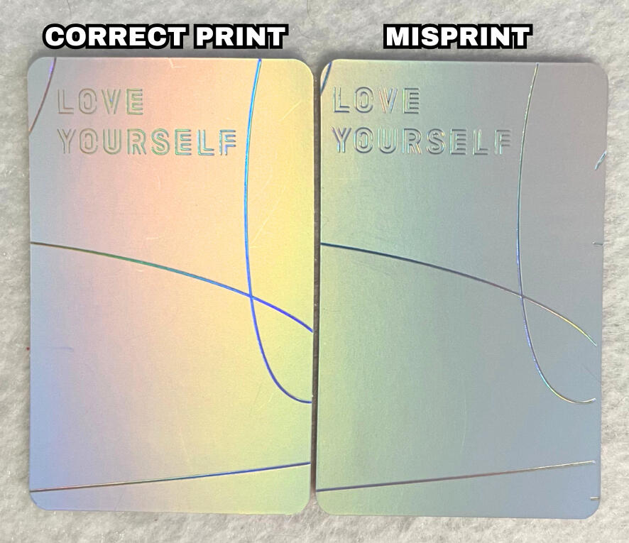
Looking at the red circles on the image, notice how the misprinted design is shifted too much to the left. This type of misprint often results in gaps between the lines and the edge, as well as extra holographic lines peeking in from the side.
NOTE: refer to the red circles on the images to show the differences.
NOTE: if you are viewing on mobile pinch to zoom & If you are viewing on a computer increase your window zoom to 300%-400% on the picture below to clearly see the difference.
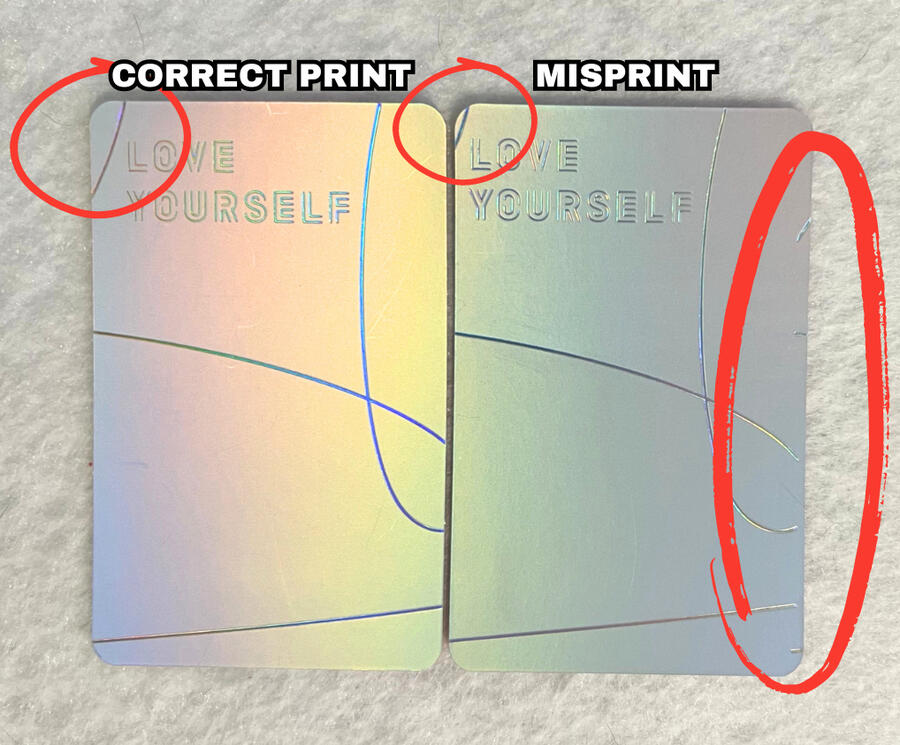
Additionally, it is not just the lines that are shifted in this misprint, the "LOVE YOURSELF" text is also shifted in the same direction, in this case, making it closer to the left edge.
NOTE: if you are viewing on mobile pinch to zoom & If you are viewing on a computer increase your window zoom to 300%-400% on the picture below to clearly see the difference.
Here is another example of the misprint on a different album version (L). Do you notice the misprint?
SPECIAL THANKS
@strawberrybias for providing the misprinted photocard.
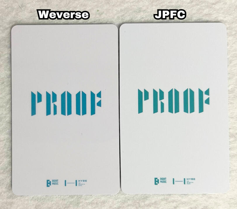
Proof Collectors Edition POB Presses
While there was only one release for the pre-order benefits for Proof (Collectors Edition), there are a few distinct difference's between the cards bought from Weverse Shop and JPFC (Japan Fanclub).
COLORING:
This is the main difference between the two photocards.
There is a clear color difference on both the front and back of the photocards.
Overall, JPFC is brighter/more vivid/saturated on both the image and the white background.
Weverse shop looks more 'dull' in comparison.
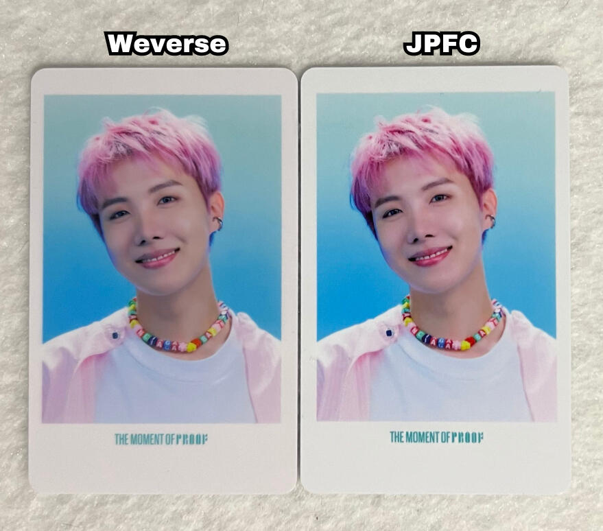
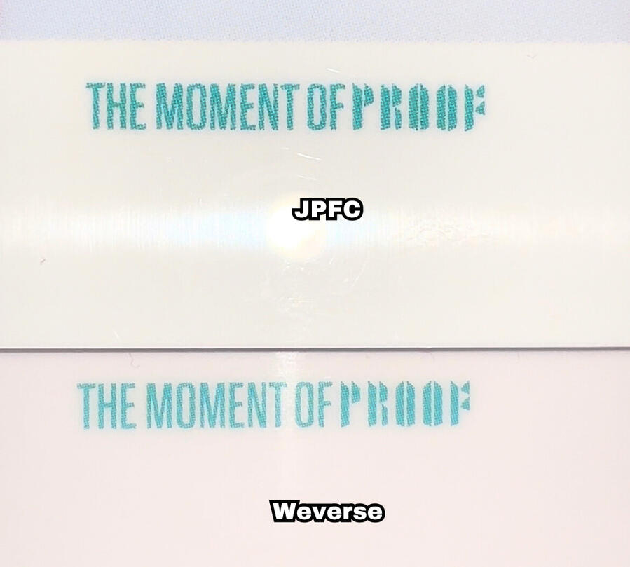
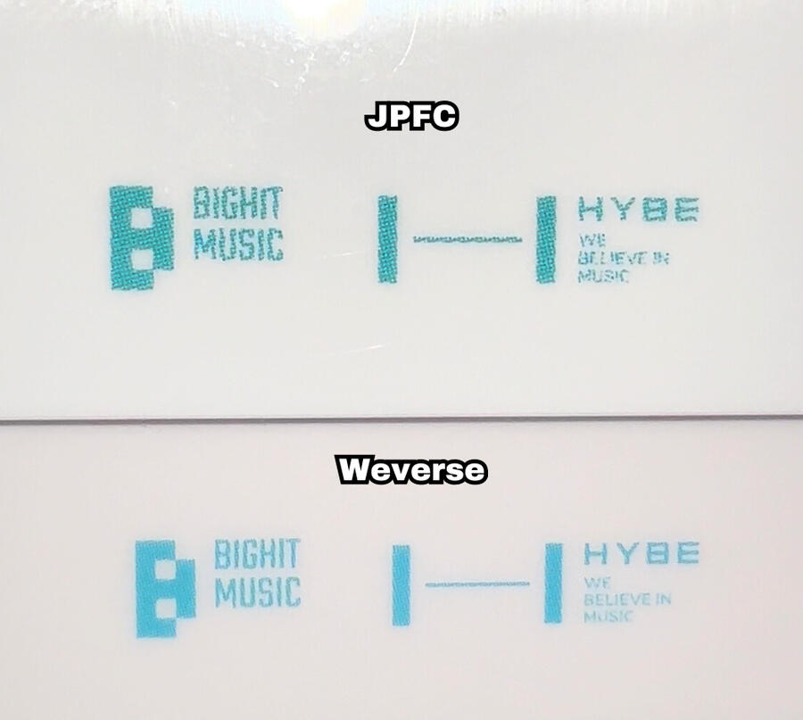
TEXT:
One small difference in the text is the thickness. The Weverse Shop photocards have thinner lettering, compared to JPFC which appears bolder/thicker.
Additionally, compared to the clean, smooth lettering on the Weverse Shop photocards, JPFC often appears 'wobbly' or 'shaky'. If you notice as well, on the back, the "we believe in music" is much less legible in the JPFC version.
NOTE: if you are viewing on mobile pinch to zoom & If you are viewing on a computer increase your window zoom to 300%-400% on the picture below to clearly see the difference.
VIDEOS:
Below are 3 videos of JPFC versions of the POB that show the 'wobbly/shaky' text quality clearer.
J-Hope's JPFC POB
Jin's JPFC POB
Jungkook's JPFC POB
SPECIAL THANKS
@98hopekook for providing the Weverse Shop photocard & @baseline_remix for the JPFC photocard & @candy6526 for the videos of Jin and Jungkook's JPFC photocards.
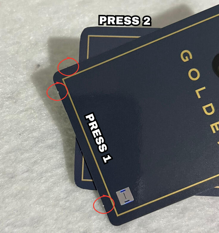
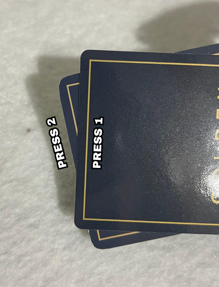
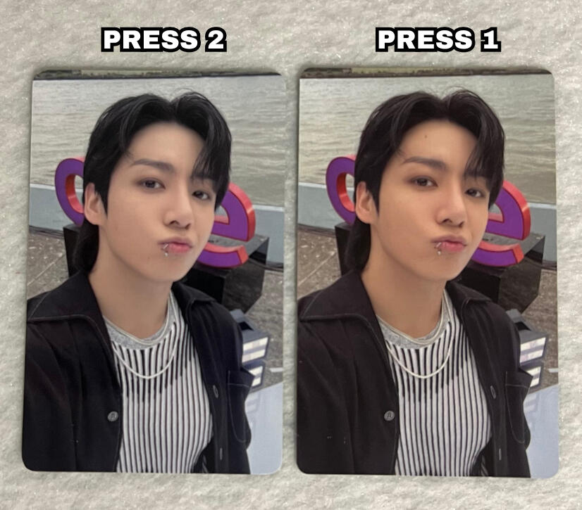
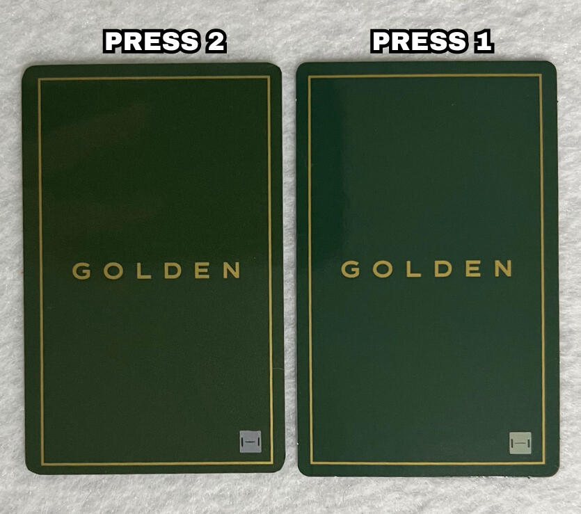
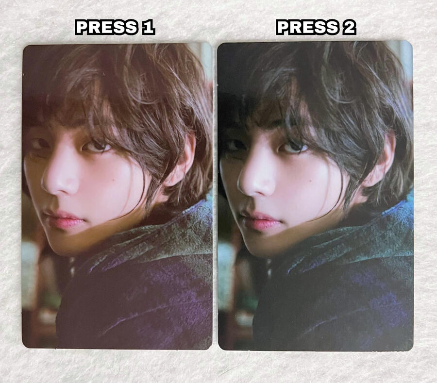
Golden Korean Lucky Draw Presses
Golden's korean lucky draws unfortunately lack in the quality control department. While there are many color inconsistencies, there are 2 main press types.
COLORING:
There is a clear color difference on both the front and back of the photocards.
On the front, press 2 appears more 'foggy' or 'hazy' where as press 1 is more crisp, clear and saturated.
On the back, press 2 has a lighter shade of both blue and yellow, where as press 1 is darker.
Additionally, while this specific card isn't the best example, typically the press 2 lucky draws have a more cool/blue tone on the front, where as press 1 is warmer/more yellow.
NOTE: There are inconsistencies with color among both press types, so while these rules generally apply, there may be press 1 cards with a coloring more similar to press 2 and vice versa.
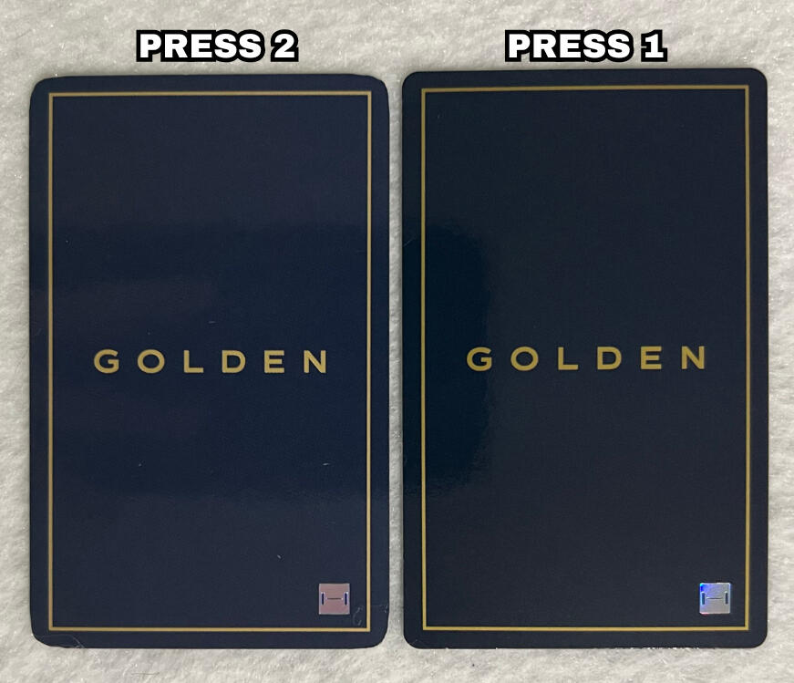
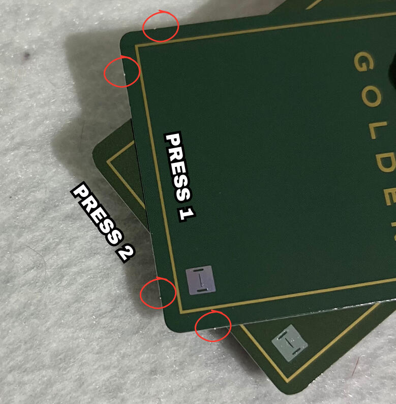
STEM CUTS:
Stem cuts are the little tabs you see on most photocards which can be on the edges or corners of photocards.
Press 1 photocards have stems cuts next to each corner (2 on each side).
Press 2 photocards do NOT have stem cuts at all.
NOTE: Refer to the red circles on the image below indicating the stem cuts.
NOTE: if you are viewing on mobile pinch to zoom & If you are viewing on a computer increase your window zoom to 300%-400% on the picture below to clearly see the difference.
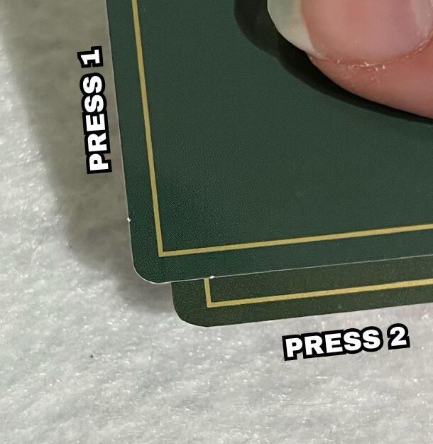
CORNERS:
Press 1 lucky draws have uniform corners that are typically a bit more 'sharp/tight' compared to press 2.
Press 2 lucky draws have inconsistent corners. They often aren't cut perfectly making them look lower quality. While generally the corners are more round compared to press 1, due to the inconsistencies, sometimes one corner can be rounder, while another can be sharper/tighter on the same card.
BORDERS:
Because of the uniformity and overall better cut quality of press 1, the yellow border on the back appears even all the way around. Press 2's borders can vary depending on the card. In the image, you can see the top border is closer to the edge compared to the border on the side.
NOTE: if you are viewing on mobile pinch to zoom & If you are viewing on a computer increase your window zoom to 300%-400% on the picture below to clearly see the difference.
EXAMPLE 2:
Here is another example of the 2 press types using the soundwave version.
Can you spot all the press differences?
differences listed at the bottom
DIFFERENCES:
Coloring: On the front, press 1 is warmer & more saturated. Press 2 is cooler & more "hazy". On the back, press 1 is lighter. Press 2 is darker & warmer toned.
NOTE: Like I mentioned earlier, coloring can vary within 1 press, especially with different versions (powerstation, soundwave, m2u).
Stem Cuts: Press 1 has two stem cuts around each corner. Press 2 has NO stem cuts.
Corners: Press 1 has even, uniform corners. Press 2 has uneven cut corners.
Borders: Press 1 has an even/equal border. Press 2 has an unequal border, the side is closer to the edge compared to the top border.
Layover Korean Lucky Draw Presses
There are two press types for Layover's korean lucky draws, specifically the soundwave store version(s).
The only visibly difference between press type 1 and 2 is the coloring.COLORING:
Press type 1: Warm tone, more 'yellow/pink' on the front and a light green banner on the back.
Press type 2: Cool tone, more 'green/blue' on the front and a dark green banner on the back.
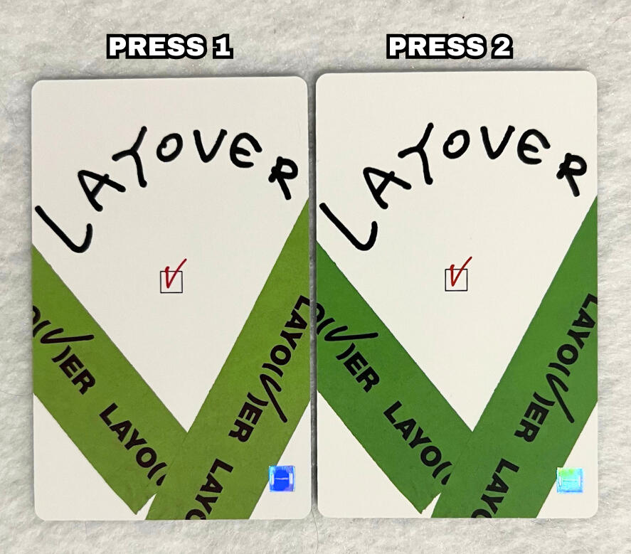
SPECIAL THANKS
@strawberrybias for providing both photocard presses.
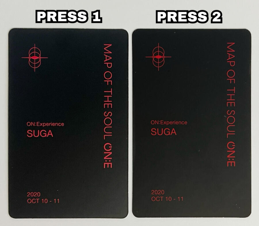
Map Of The Soul ON:E DVD Presses
There are two (main) presses for the MOTS ON:E DVD photocards.
The only visibly difference between press type 1 and 2 is the coloring. From experience, this difference has been most noticeable for Yoongi's photocards.COLORING:
Press type 1: Warm tone, more 'yellow/pink' on the front and the red text on the back is slightly lighter/brighter.
Press type 2: Cool tone, more 'blue/purple' on the front and the red text on the back is slightly darker/deeper.
Wings Photocard Presses
The Wings album polaroids have two main presses.
COLORING/QUALITY:
Similarly to the Young Forever photocards, the old press Wings photocards are more vibrant/saturated, whereas the new press one's are less saturated and more "whitened". The new press photocards also typically are slightly more blurry or "foggy" in quality compared to the old press.
NOTE: if you are viewing on mobile pinch to zoom & If you are viewing on a computer increase your window zoom to 300%-400% on the picture below to clearly see the difference.
ALIGNMENT:
While the cropping of the images themselves are consistent among both presses, the old press images are shifted slightly higher compared to the new press.
NOTE: Refer to the red lines in the image to show the different alignment.
NOTE: if you are viewing on mobile pinch to zoom & If you are viewing on a computer increase your window zoom to 300%-400% on the picture below to clearly see the difference.
ALIGNMENT:
Just like the front of the photocard, the text on the back of the old press polaroid is slightly higher than the new press.
NOTE: Refer to the red line in the image to show the different alignment.
NOTE: if you are viewing on mobile pinch to zoom & If you are viewing on a computer increase your window zoom to 300%-400% on the picture below to clearly see the difference.
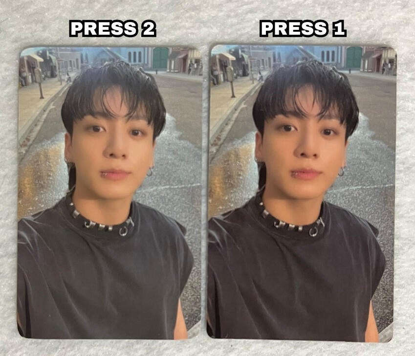
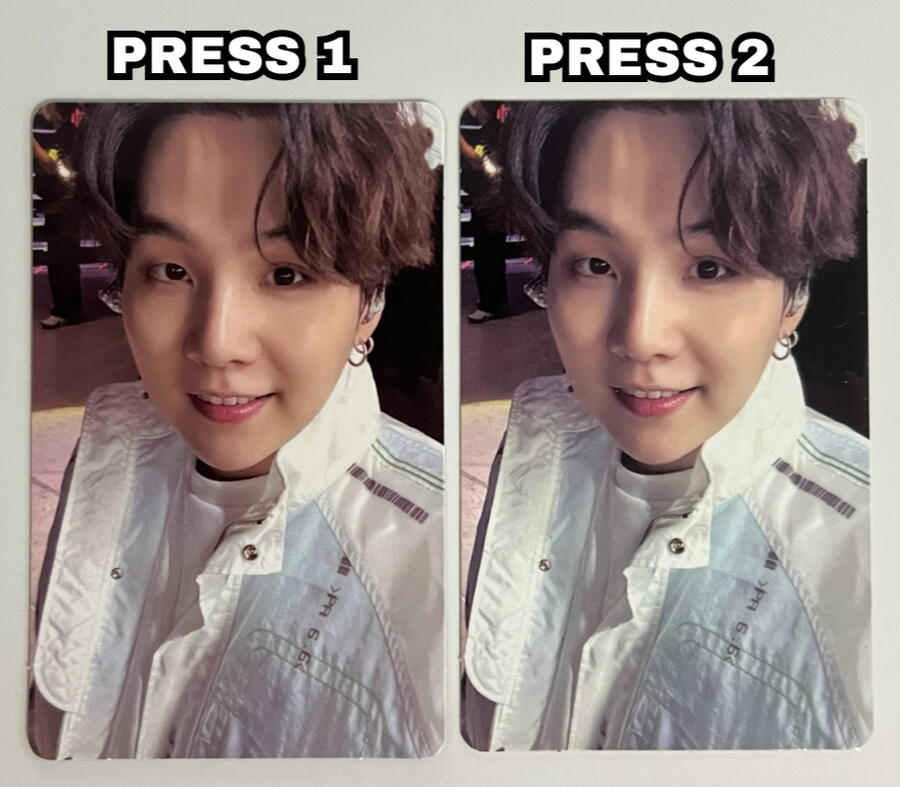
Fanmeeting Vol. 5 Photocard Presses
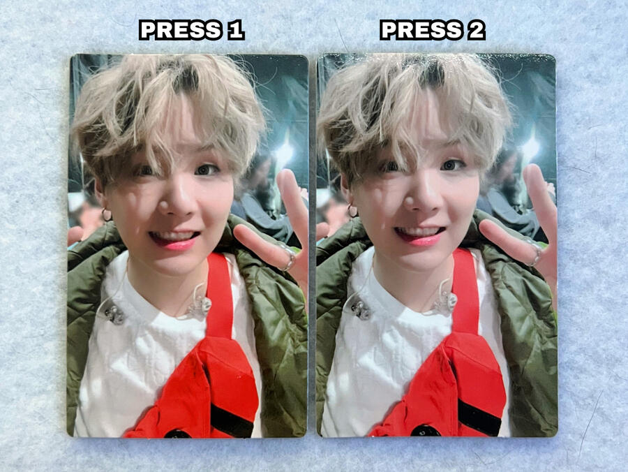
The Fanmeeting Volume 5 (FMV5 or Magic Shop Japan) photocards have two main press types with the coloring being the main difference.
COLORING:
The main difference between press 1 and press 2 is the color. The difference is mainly on the back, however there are subtle differences on the front.
It is very subtle, but press 1 has a warmer/more saturated coloring compared to press 2.
Press 2 is slightly brighter/cooler, looking a bit more 'washed out'.
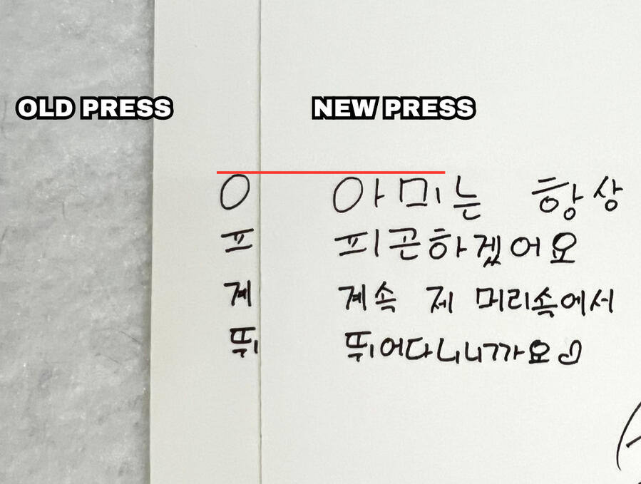
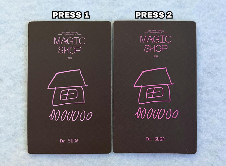
The Back:
Press 1: Darker brown, lighter pink text.
Press 2: Lighter brown, darker pink text.
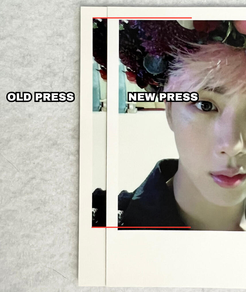
CROPPING:
While it is very subtle, press type 2 photocards are typically shifted slightly upwards (sometimes slightly to the left/right as well).
NOTE: Please refer to the white circles on the image showing the difference (Suga's button & jacket).
NOTE: if you are viewing on mobile pinch to zoom & If you are viewing on a computer increase your window zoom to 300%-400% on the picture below to clearly see the difference.
IMPORTANT DISCLAIMER
There are a LOT of fakes on the market of this photocard that typically have a closer resemblance to press type 2 cards (the darker pink text specifically). To determine if a Fanmeeting Vol. 5 photocard is fake or simply press type 2, check out this guide to help.The difference between press 1 and 2 is ONLY the coloring & image position. They should NOT be zoomed in, have round corners that look like the 5th muster dvd pcs, have a different texture, poor quality text/font printing, etc.
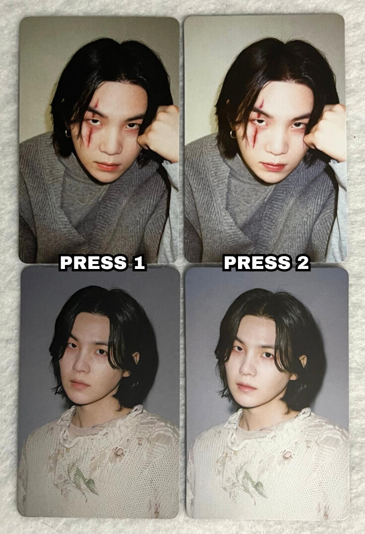
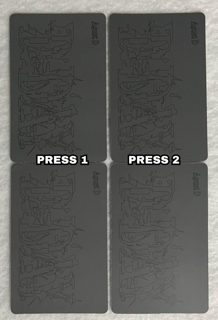
D-Day Target Exclusive Presses
The D-Day Target exclusive photocards have a minor press difference/printing variation.
COLORING:
The only difference between press 1 and press 2 is the color.
Press 1 is darker and more saturated, whereas press 2 is much brighter causing the coloring to look more white/washed out.
There are no other noticible differences between the two press types.
SPECIAL THANKS
@gbf_fork for providing both photocard presses.
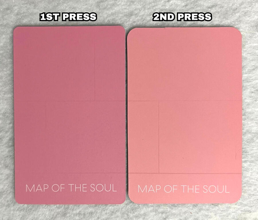
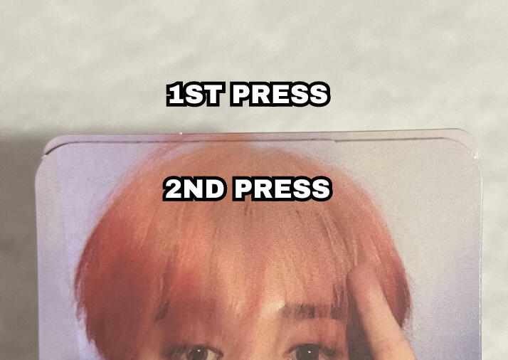
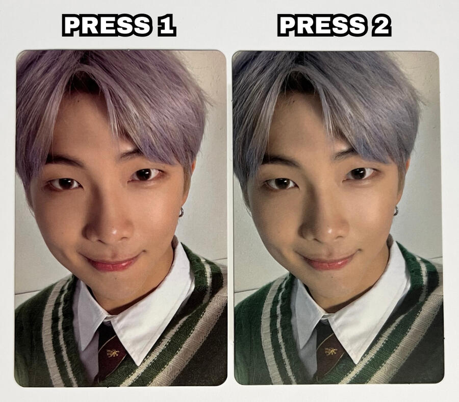
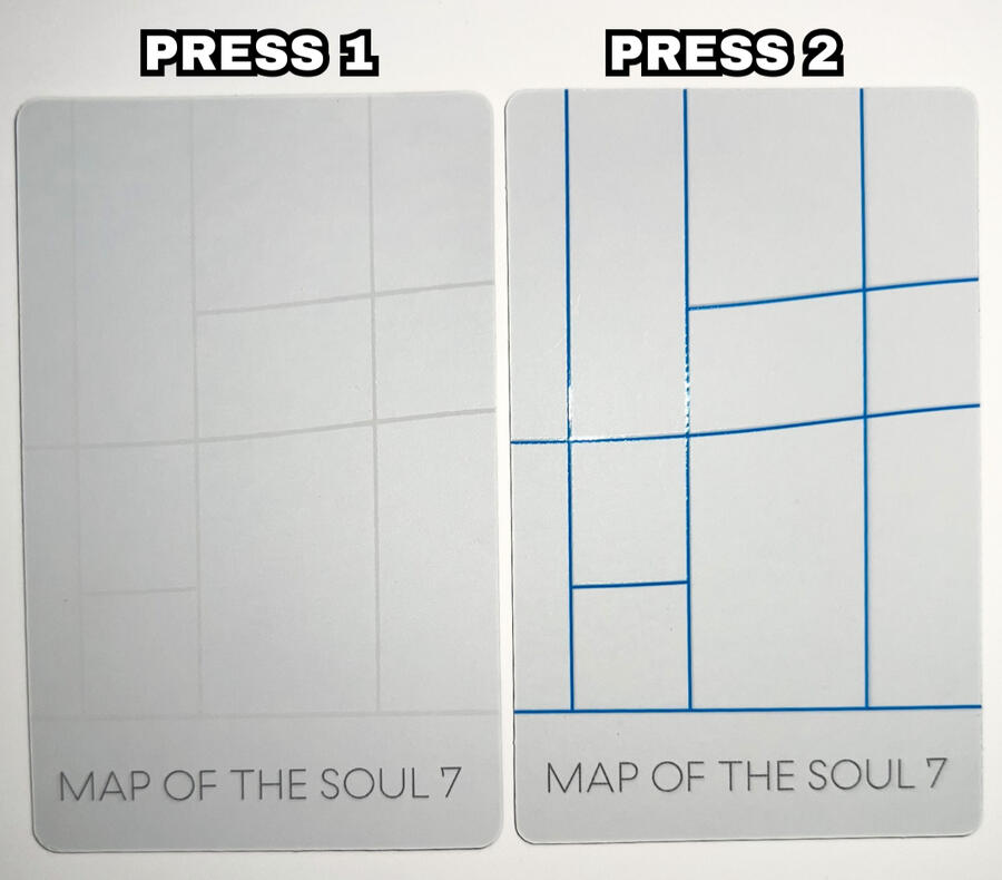
Map Of The Soul: 7 Photocard Presses
Map Of The Soul: 7 has 2 main press types. The biggest difference being the coloring of the grid design on the backs of the photocards, however there are a few other differences to note.
COLORING:
The biggest and most notable difference between press 1 and press 2 is the grid design on the back.
Press 1: white/gray design. more subtle, may not always appear very clearly on camera.
Press 2: bold blue design.On the front of the photocards, the image coloring is different between the two press types. Based on my best judgment, there is a different balance regarding the tint.
*this refers to the balance of green and magenta tones in an image.
Press 1: Magenta leaning. skin tones, hair, etc appear more warm, natural and vibrant.
Press 2: Green leaning. Results in looking more yellowy/washed out, with some colors appearing more cool toned.
TEXTURE:
The grid design on the back of the photocards should be glossy and slightly raised against the matte white background for BOTH press types.
NOTE: Please watch the video below for clarification.
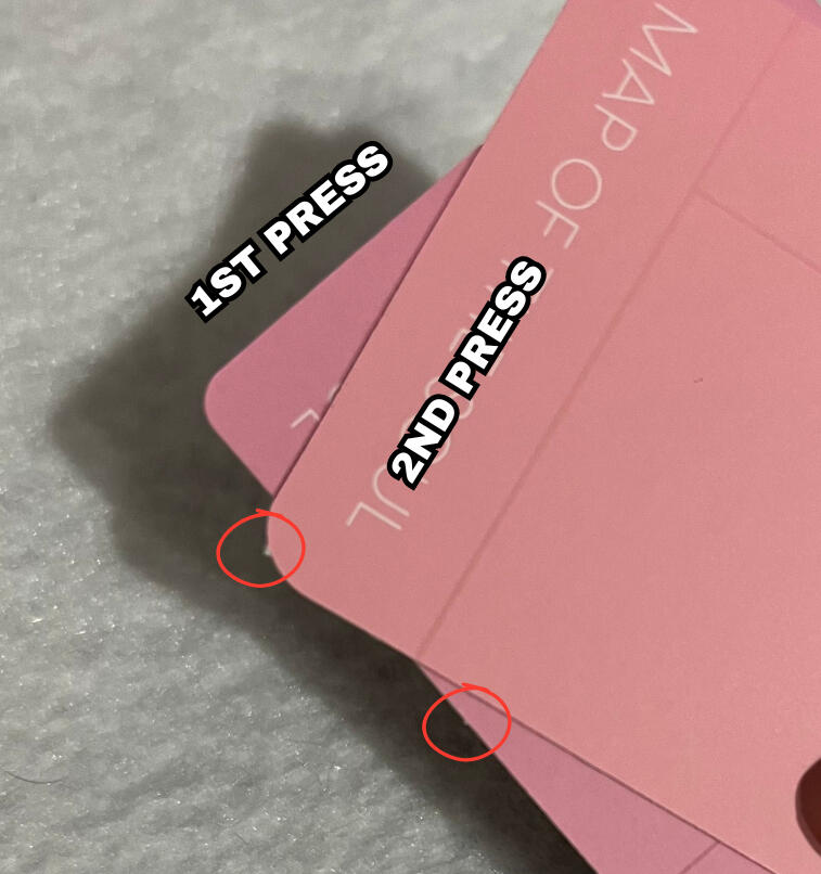
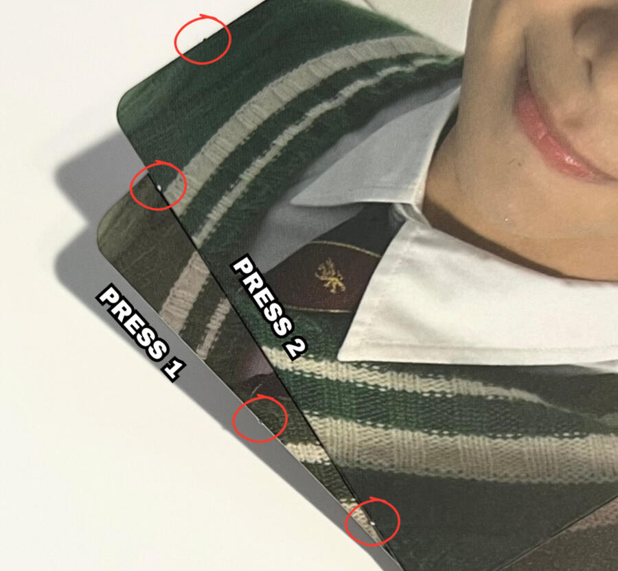
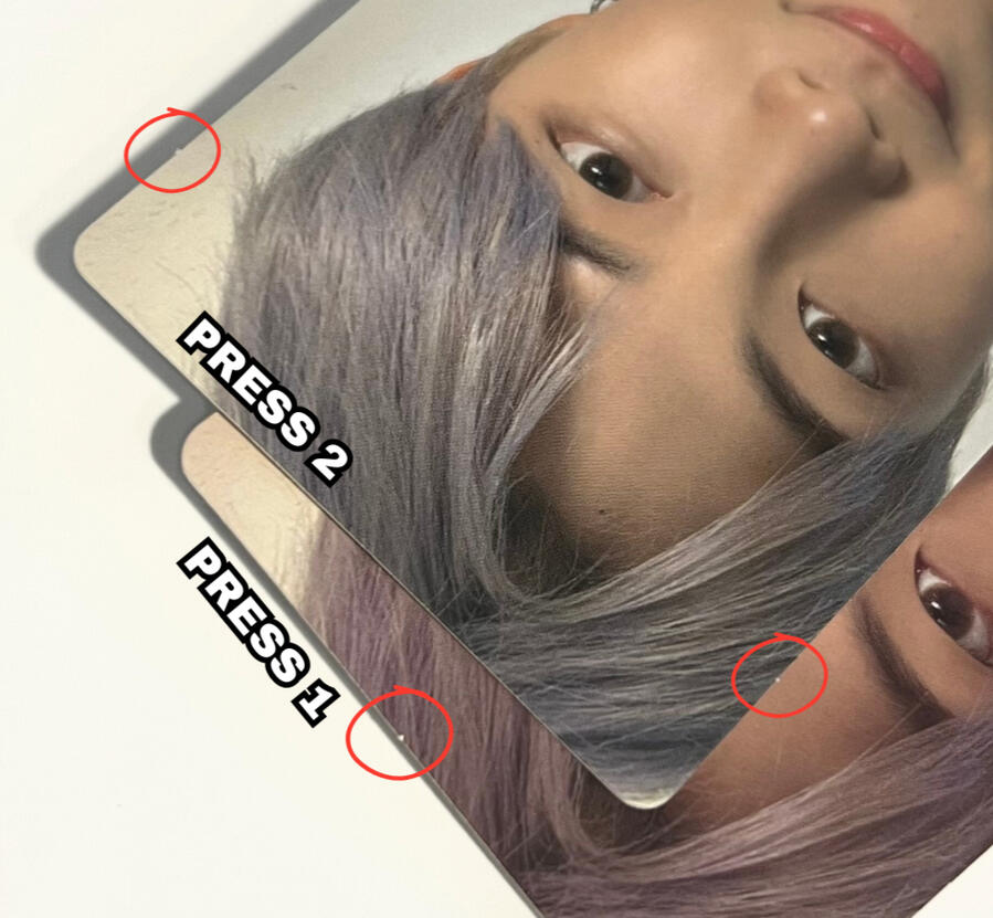
STEM CUTS:
Stem cuts are the little tabs you see on most photocards which can be on the edges or corners of photocards.
NOTE: Stem cuts can be inconsistent and may NOT always be the best indicator for determining press types alone. Be sure to check for the more significant known differences as well.
Press 1 photocards tend to have 1 stem cut on the top and bottom as well as sometimes on the sides. However, it is important to keep in mind there are press 1 photocards that have a similar stem cut pattern as press 2.
Press 2 photocards seem to have 2 stem cuts on the bottom and 1-2 stem cuts along each side.
NOTE: Refer to the red circles on the images below indicating the stem cuts.
NOTE: if you are viewing on mobile pinch to zoom & If you are viewing on a computer increase your window zoom to 300%-400% on the picture below to clearly see the difference.
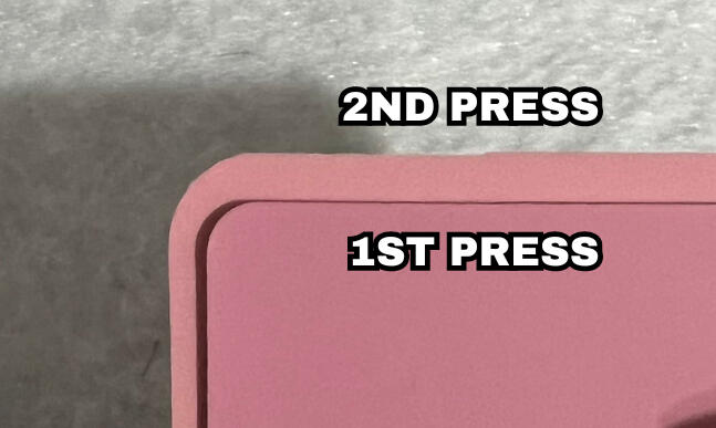
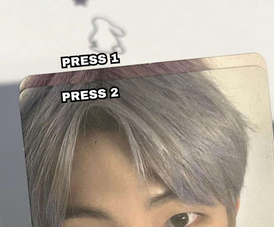
CORNERS:
Press 1 photocards have slightly rounder corners, whereas the corners on press 2 appear to be slightly sharper/tighter. It is a very minor observation, please refer to the images below.
NOTE: if you are viewing on mobile pinch to zoom & If you are viewing on a computer increase your window zoom to 300%-400% on the picture below to clearly see the difference.
SPECIAL THANKS
@crystal.0922_ for providing the press 2 photocard.
Special Thanks & Additional Resources.
While this guide is simply a passion project of mine, it would not have been possible without the help of many different collectors!NOTE: if anyone is uncomfortable with me linking their account/post here and would like me to remove it just message me ♡︎
Contributors: